PearTree Manual
PearTree is a phylogenetic tree viewer that runs entirely in the browser or as a desktop application. No data is ever uploaded to any server — all processing is local to your machine.
Where to get PearTree
- Web application: https://peartree.live (Chrome, Firefox, Safari, Edge)
- Desktop app: https://github.com/artic-network/peartree/releases (macOS, Windows, Linux)
All features described in this manual work in both versions unless noted.
Contents
- The Interface at a Glance
- Loading Trees
- Importing Annotations
- Navigating the Tree
- The Hyperbolic Lens
- Selecting and Filtering
- Organising the Tree
- Decorating the Tree
- Filtering
- The Time Axis
- Rooting
- The Root-to-Tip Panel
- The Data Table Panel
- Exporting
- Settings and Persistence
- Appendix A: Keyboard Shortcuts
- Appendix B: Bootstrap Values and Branch Annotations
- Appendix C: URL Parameters and Sharing
Chapter 1: The Interface at a Glance
When a tree is loaded the interface has four main areas:

Toolbar
Runs along the top of the window. Contains buttons grouped by function:
| Group | What it contains |
|---|---|
| Visual Options | Toggle the Visual Options palette (also Tab) |
| File | Open tree, import annotations, export tree, export graphic |
| Annotations | Annotation curator |
| Info | Node info (⌘I) |
| Navigation | Back, forward, drill into subtree, climb up one level, home |
| Zoom | Zoom in, zoom out, fit all, fit labels |
| Order | Sort clades ascending / descending |
| Rotate | Rotate selected node, rotate entire subtree |
| Rooting | Node / branch mode toggle, invert selection; reroot, midpoint root, global temporal root, local temporal root |
| Hide / Show | Hide selected subtree, unhide |
| Collapse | Collapse clade to triangle, expand triangle |
| Colour | Colour picker swatch, apply colour, clear user colours, highlight clade, clear highlights |
| Filter | Tip filter box with field selector, match-operator selector, saved-filter selector, save-filter button, and buttons for Manage Filters / Manage Palettes |
| Panels | Data table panel toggle, root-to-tip panel toggle |
Visual Options Palette
Slides in from the right. Toggle with the Control Panel button in the toolbar or press Tab. Contains all display controls organised into collapsible sections.
Status Bar
Runs along the bottom. Shows live annotation values for the tip or node under the cursor. Also displays mode messages such as Lens mode active – press Esc to cancel.
Canvas
The tree drawing fills all available space between the toolbar and status bar. Zoom and scroll with the mouse or trackpad. The tip labels are not shown unless zoomed to a level that they don't overlap.
Chapter 2: Loading Trees
Supported Formats
PearTree reads NEXUS (.nex, .nexus, .tre, .tree, .treefile) and Newick (.nwk, .newick) files. Tree data stored in NEXUS metacomments (e.g. BEAST output) is fully supported.
Opening a File
Click the Open button in the toolbar, or press ⌘O, to open the Open Tree File dialog.
Three tabs are available:
File tab — drag a file onto the drop zone or click Choose file to browse.
Open Tree File
Drag and drop your tree file here
NEXUS (.nex, .nexus, .tre, .tree, .treefile) or Newick (.nwk, .newick)
Open Tree File dialog, File tab. The file stays on your computer — nothing is uploaded.
URL tab — paste a public URL to a remote tree file and click Load from URL. The remote server must allow cross-origin requests (CORS). GitHub raw URLs (raw.githubusercontent.com/…) work out of the box.
Open Tree File
Drag and drop your tree file here
NEXUS (.nex, .nexus, .tre, .tree, .treefile) or Newick (.nwk, .newick)
Open Tree File dialog, URL tab.
Example tab — choose from a set of built-in example datasets:
| Dataset | Description |
|---|---|
| Ebola virus (EBOV) | Phylogenetic tree from the 2014–2016 West Africa epidemic — used throughout the examples in this manual |
| SARS-CoV-2 (15K) | Large SARS-CoV-2 tree with ~15,000 sequences — useful for testing performance with big trees |
| Variola virus (VARV) | Smallpox virus (variola) phylogeny |
Click a dataset card to load it immediately.
Open Tree File
Drag and drop your tree file here
NEXUS (.nex, .nexus, .tre, .tree, .treefile) or Newick (.nwk, .newick)
Open Tree File dialog, Example tab.
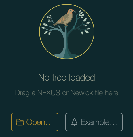
The Startup Screen
When no tree is loaded, the canvas shows the startup screen with direct Open… and Example… buttons. Or a tree file can be dragged directly on to the startup screen.
Opening a NEXUS File with Embedded Settings
If a NEXUS file was exported from PearTree with Embed settings ticked (see Chapter 14), opening it restores the full visual appearance automatically — theme, palette choices, colouring, legends, and axis configuration.
Chapter 3: Importing Annotations
Tree files embed per-tip metadata written by the inference tool (e.g. BEAST posterior values, HPD intervals). You can also add your own metadata from an external table at any time.
Importing a CSV or TSV File
Click the annotation-import button in the toolbar or press ⌘⇧A.
Import Annotations
Drag and drop your annotation file here
CSV (.csv) or Tab-separated (.tsv)
Import Annotations dialog.
Drag a CSV or TSV file onto the drop zone, or click Choose file to browse. In the web app you can also switch to the URL tab and paste a public URL directly — for example the EBOV annotation file used in this manual:
https://artic-network.github.io/peartree/docs/data/ebov.csv
Match Configuration
After selecting the file a configuration step appears. Choose which column in the metadata file identifies each tip:
ebov.csv
104 rows, 5 columns
Import configuration: choose the column that matches tip labels, and toggle which columns to import.
PearTree can match the entire tip label string, or just one pipe-delimited (|) field within it. For the EBOV example, select field 2 (lab-id) to match the second segment of each label.
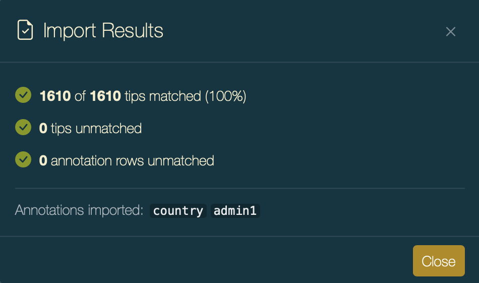
Import Summary
After clicking Import, a summary reports how many tips were matched.
After import the new annotation keys appear in all Colour by dropdowns, the legend selector, and the Node Info dialog.
The Annotation Manager
Open the Annotation Manager from the toolbar to review every annotation key currently loaded.
Annotations
| Annotation | Type | On | Observed range | Scale bounds | ||
|---|---|---|---|---|---|---|
| Names tip name | — | T | — | — | — | |
| country | categorical | T | 3 values | — | ||
| date | date | T | 2014-06-06 … 2015-09-18 | 2014-06-06 … 2015-09-18 | ||
| lineage | categorical | T | 5 values | — |
For each annotation you can:
| Action | Description |
|---|---|
| Rename | Give an annotation a more readable display label |
| Change type | Switch between categorical and real (continuous numeric) |
| Palette | Open colour settings for the annotation (palette choice and numeric scale mode) |
| Branch annotation | Mark an annotation as belonging to branches rather than nodes — affects how values move when rerooting (see Appendix B) |
Parse Tip Names
The Parse Tips button at the bottom of the Annotation Curator opens the Parse Tip Names dialog. This extracts a new annotation from tip names by splitting each label on a delimiter.
Parse Tip Names
Extract an annotation from tip names by splitting on a delimiter.
| Field | Description |
|---|---|
| Name | The annotation key that will be created |
| Delimiter | The character(s) used to split each tip label (e.g. |, _, -) |
| Field | Which segment to extract: 1 = first, 2 = second, -1 = last, etc. |
| Type | Data type for the new annotation — Auto-detect examines all values and picks the most specific type |
| Missing | A field value that should be treated as missing data (shown as an empty cell) |
A preview of how three example tip labels will be parsed is shown at the bottom of the dialog.
Chapter 4: Navigating the Tree
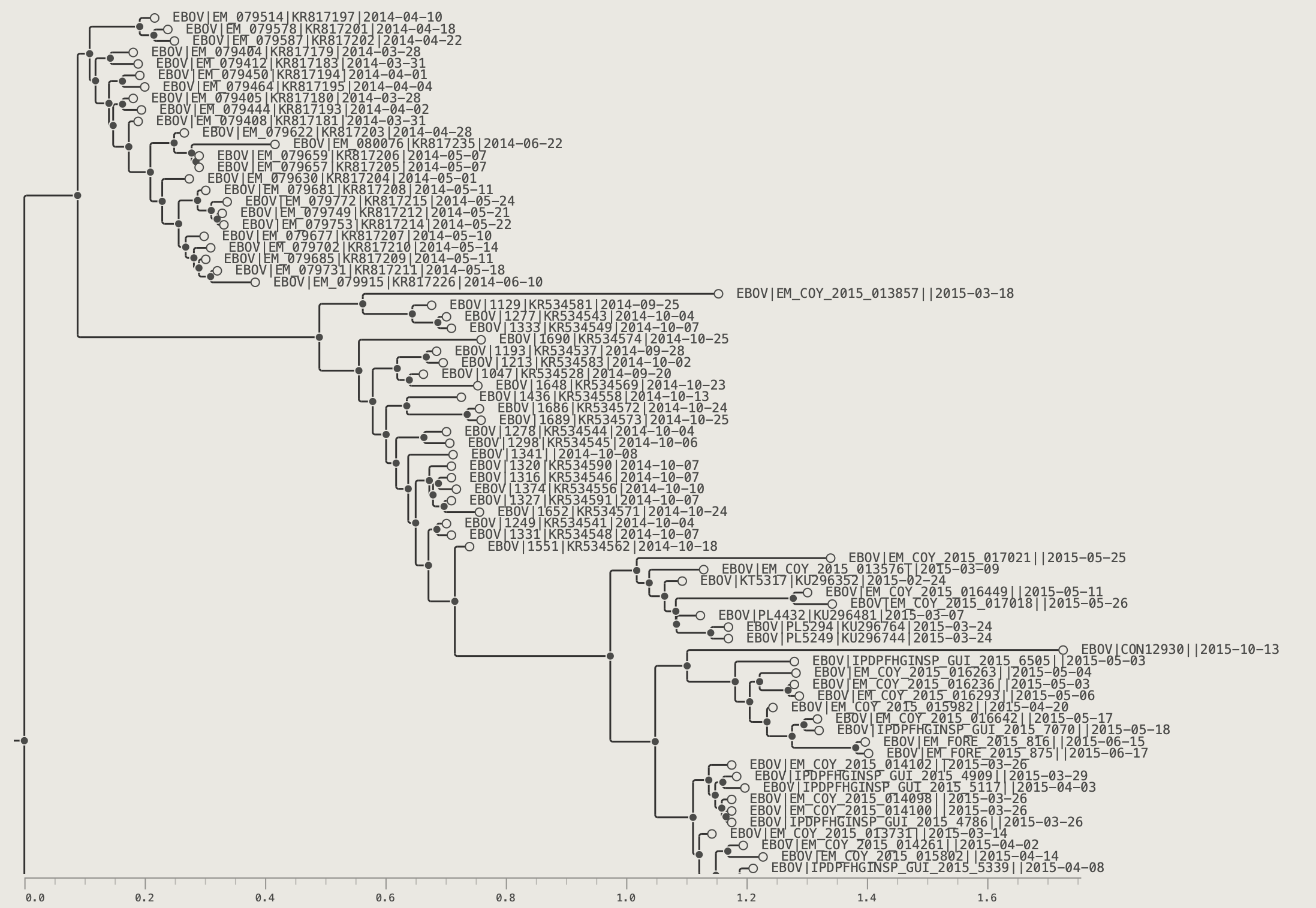
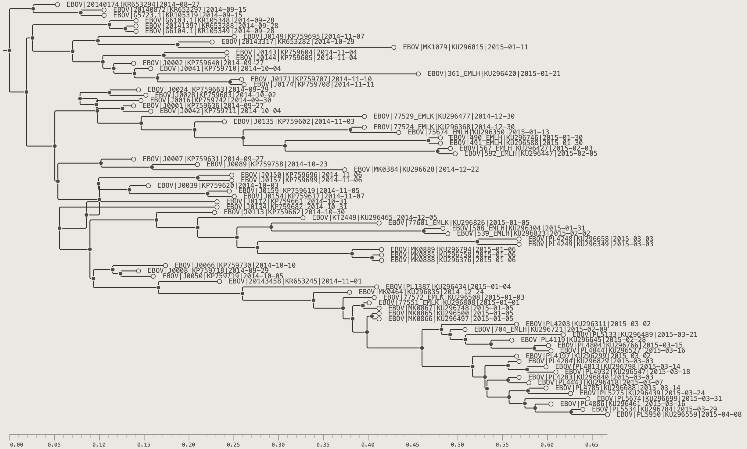
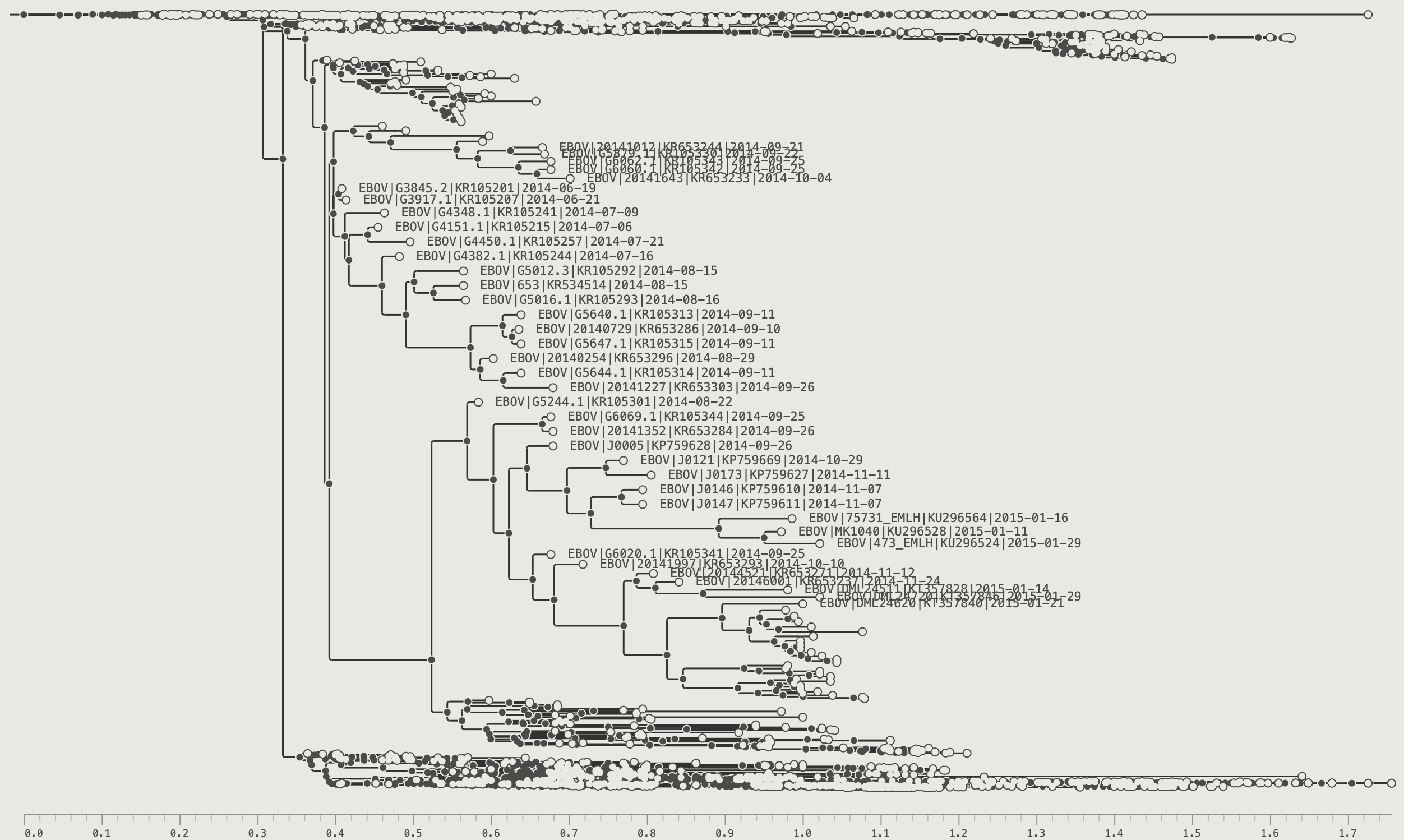
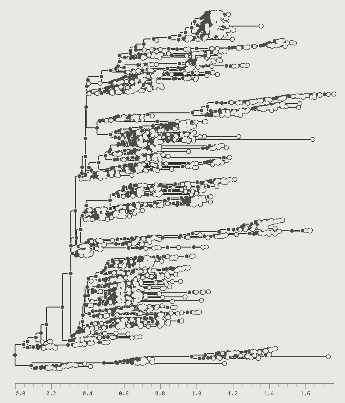
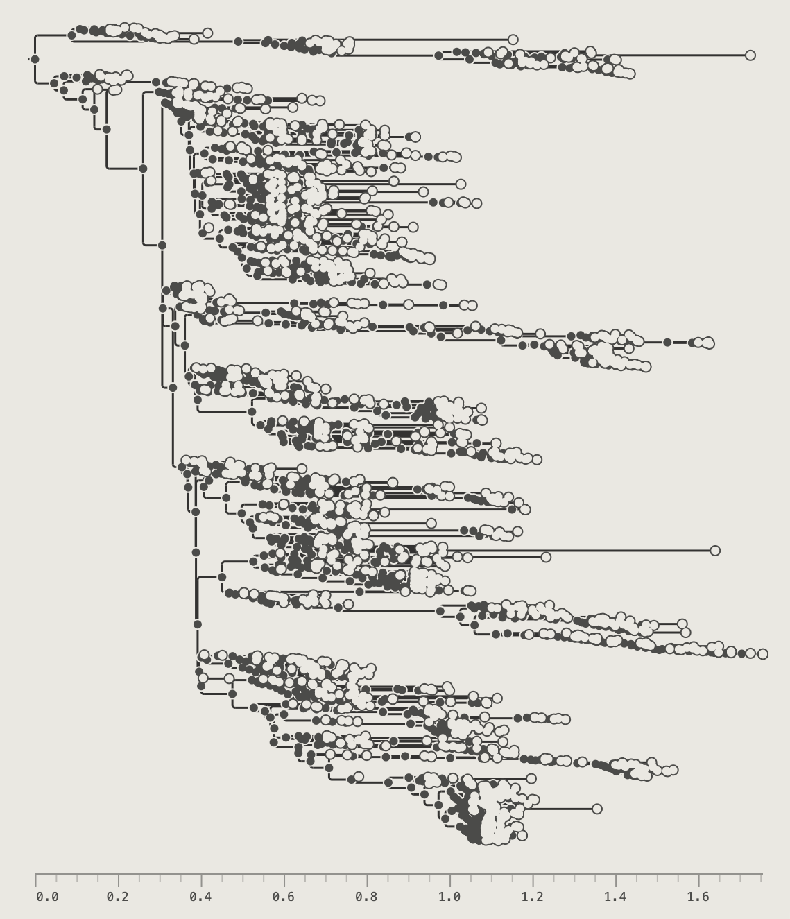
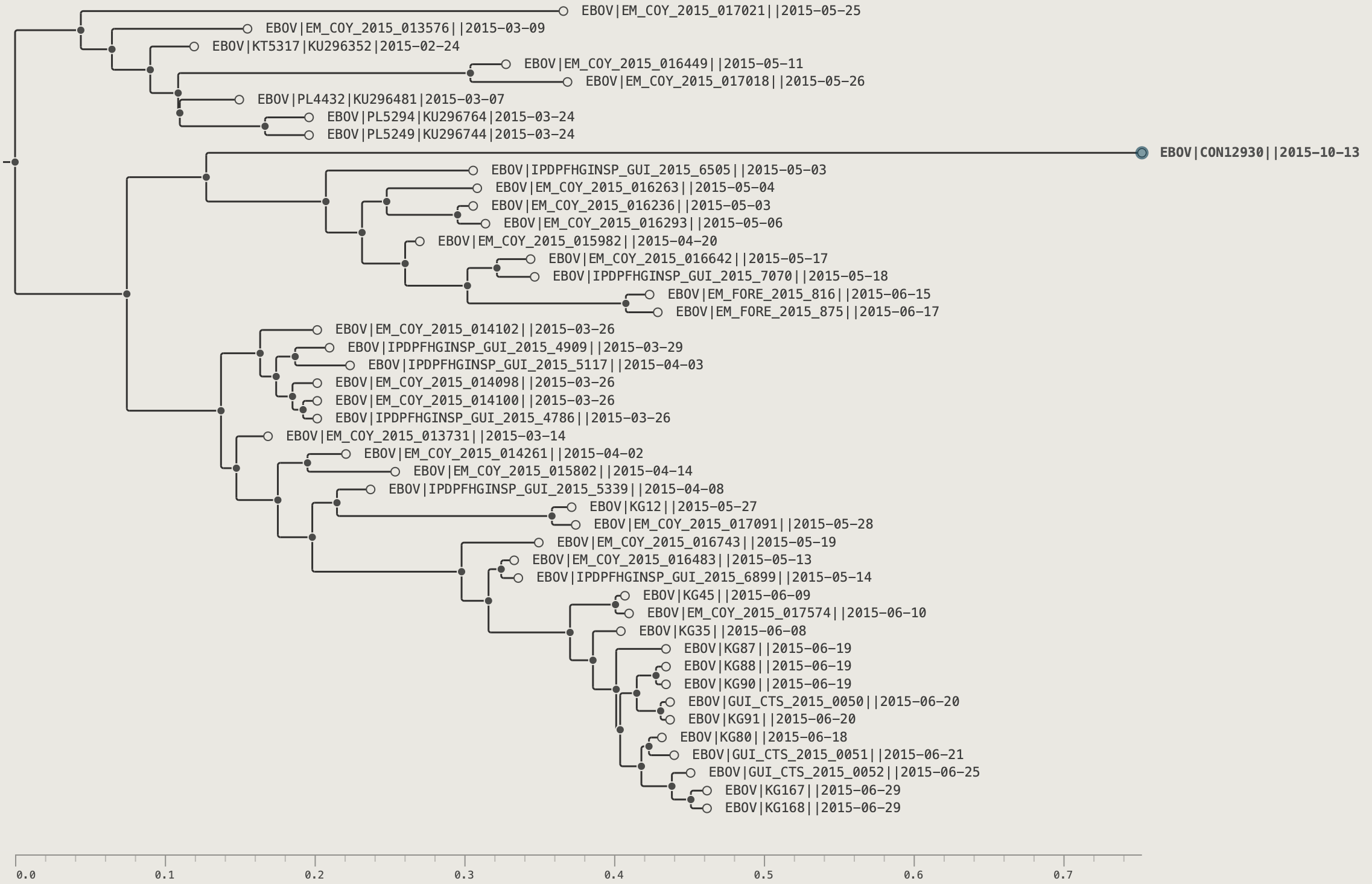
The examples in this chapter use the EBOV example tree (1610 tips). For navigation in very large trees, try loading data/SARS-CoV-2_15K.tree (15,000 tips).
There are a range of option for zooming into the tree, scrolling and navigating into subtrees or clades. The mouse/trackpad can be used to scroll and zoom with the scroll wheel or with standard gestures on the trackpad. Various hotkeys can be used to get more precise control.
Scrolling and Zooming
| Gesture / key | Effect |
|---|---|
| Scroll wheel / two-finger drag | Pan vertically |
| ⇧ + scroll | Zoom in/out, anchored at the cursor position |
| Pinch (trackpad) | Zoom in/out |
| ↑ / ↓ | Scroll one row |
| ⌘↑ / ⌘↓ | Scroll one page |
| ⌘⇧↑ / ⌘⇧↓ | Jump to the top or bottom of the tree |
The toolbar also has buttons for zooming in and out and fitting the tree to the window or expanding to see the labels. These buttons also have keyboard shortcuts.
Toolbar zoom buttons:
| Button | Shortcut | Action |
|---|---|---|
| ⌘+ | Zoom in ×1.5 | |
| ⌘− | Zoom out ×1.5 | |
| ⌘0 | Fit entire tree to window | |
| ⌘⇧0 | Fit Labels — zoom so no tip labels overlap |
The Fit Labels button or ⌘⇧0 keyboard shortcut zooms the tree vertically sufficiently that the labels can be shown without any overlap. This will depend on the label font size (set in the Tip Labels section of the control panel). If one or more tips are selected then the zoom will keep the these visible in the window.
Press button or ⌘0 keyboard shortcut to return to the full view of the tree (this may hide the tip labels again if there is not enough space to show them).
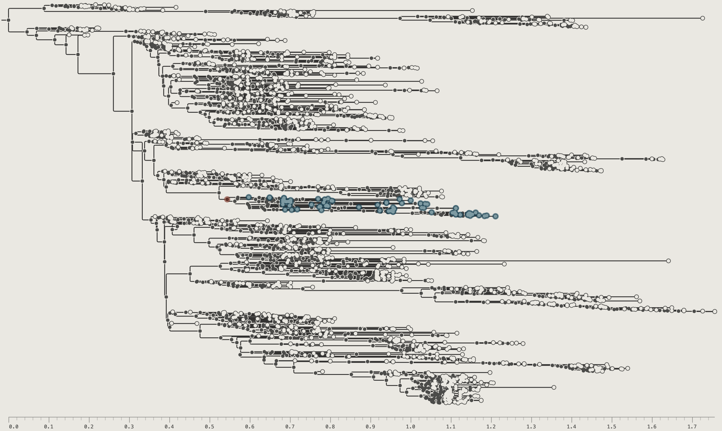
Subtree Navigation
Double-click any internal node to zoom into its subtree. The canvas re-renders showing only the descendants of that node, scaled to fill the full window. Alternatively, select an internal node or a set of tips (this will select the most recent common ancestor of the tips) and click the drill-down button or press ⌘⇧>.
PearTree maintains a full navigation history that works like a web browser. Drill down into several different clades in sequence, then press ⌘[ to step back through each view. ⌘] goes forward again. This makes it easy to compare distant parts of a large tree without re-navigating each time.
The Climb Up button or ⌘⇧< keyboard shortcut moves the view out to include the direct parent node (i.e., one node closer to the root). The Home button or ⌘\ keyboard shortcut restores the view to show the entire tree. Both these steps will be included in the navigation history so the back button will take you back to the former view.
Navigation tools:
| Button | Shortcut | Effect |
|---|---|---|
| ⌘[ | Go back to the previous view in the navigation history | |
| ⌘] | Go forward in the navigation history - restoring a view after using the back function | |
| ⌘⇧ | Drill into selected subtree opening a new view showing only that subtree | |
| ⌘⇧< | Step up one level toward the root revealing including node above the current subtree | |
| ⌘\ | Return to the full-tree root view |
Chapter 5: The Hyperbolic Lens
The hyperbolic lens expands a region of the tree to label-readable spacing without losing the surrounding context — the rest of the tree compresses but remains fully visible.
Activating the Lens
Hold ~ (tilde/backtick) and move the cursor over the canvas. The tree distorts around the cursor's vertical position.
The lens persists after you release ~ — the focus locks in place so you can click, select, or inspect the expanded region normally. Re-hold ~ and move to reposition the focus. Press Escape to dismiss.
Clicking the Fit Labels button or ⌘⇧0 keyboard shortcut will turn off the lens mode with the visible labels centred on the screen.
While the lens is active a reminder appears in the status bar: Lens mode active – press Esc to cancel.
Chapter 6: Selecting and Filtering
Selection Modes
PearTree has two selection modes – node selection and branch selection. Which mode is currently in operation is shown by the toolbar buttons . The default is the node selection mode.
Node selection operations
- Click a tip — selects that tip; the status bar shows its name and divergence
- Click an internal node — selects all descendant tips; a teal MRCA ring marks the node
- ⌘-click — add to or remove from the current selection
- Click and drag — drag-select all tips within a rectangular area
- ⌘A — select all visible tips
- ⌘⇧I — invert the selection (also available as the toolbar button)
- Click empty canvas — clear the selection
Branches mode (⌘B)
Press ⌘B or click the branch-mode button to switch. Click anywhere along a horizontal branch to place a precise positional marker. This mode enables exact-position rerooting (see Chapter 11).
Press ⌘B again to return to Nodes mode.
Selecting with the Filter Box
Typing into the filter box in the toolbar is the quickest way to select tips by name or annotation value. Choose a field and operator from the buttons to the left of the input, then type a value — matching tips are selected immediately.
For example, choose Name contains and type SLE to select all Sierra Leone EBOV tips. Press Escape or clear the box to remove the filter (the selection remains in place).
For the full set of filter operators, saved named filters, and the Filter Manager, see Chapter 9.
Node Info
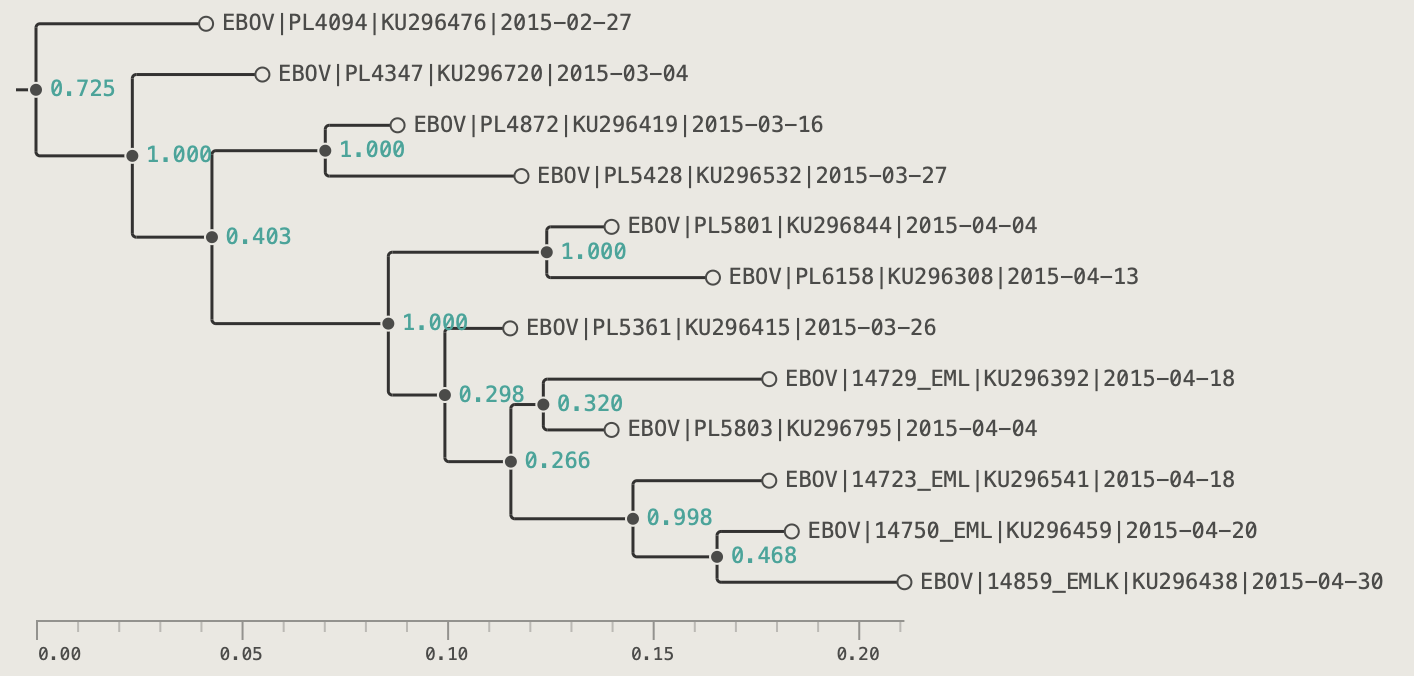
Select any node or tip, then press ⌘I or click the button. The Node Info dialog lists every annotation on that node — name, divergence, branch length, posterior support, date, and any imported custom fields. The node can be named by typing into the text field and this will be used as a name for the clade (or can be displayed as a node label).

The tip info box similarly shows information and annotations for the selected tip such as those loaded from a CSV file.
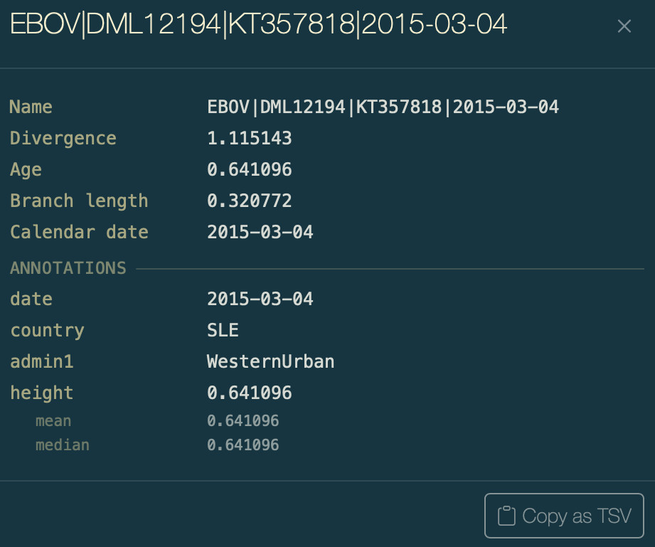
In both boxes the Copy as TSV button will copy the contents of the box to the clipboard in TSV format for pasting into another application such as a spreadsheet.
Chapter 7: Organising the Tree
Branch Ordering
The Order buttons sort all clades by descendant count, giving a ladder-like layout. This can be useful to provide a clearer layout of the tree.
The node ordering buttons:
| Button | Shortcut | Effect |
|---|---|---|
| ⌘U | Larger clades toward the top | |
| ⌘D | Larger clades toward the bottom |
Rotating Nodes
'Rotating' swaps the order of a node's direct children (or recursively all children in a clade). This is a purely cosmetic change — the topology and branch lengths are unchanged.
Select an internal node, then use the Rotate buttons:
The node rotation buttons:
| Button | Effect |
|---|---|
| Reverse the direct children of the selected node only | |
| Recursively reverse children at every level within the selected subtree |
- Select an internal node in the tree.
- Click the rotate node button in the toolbar.
- Click the rotate clade button in the toolbar.
Hiding Nodes and Subtrees
Hiding removes a tip or entire subtree from the display without deleting it from the underlying tree. The remaining tree reflows to fill the space.
- Select a tip or internal node.
- Click the Hide button in the toolbar.
- Select a clade in the tree.
- Click the Hide button in the toolbar.
Showing hidden nodes: when any hidden nodes exist in the current view, the Unhide button becomes active.
- With a node selected — click Unhide to restore the hidden descendants of that node.
- With nothing selected — click Unhide to restore all hidden nodes at once.
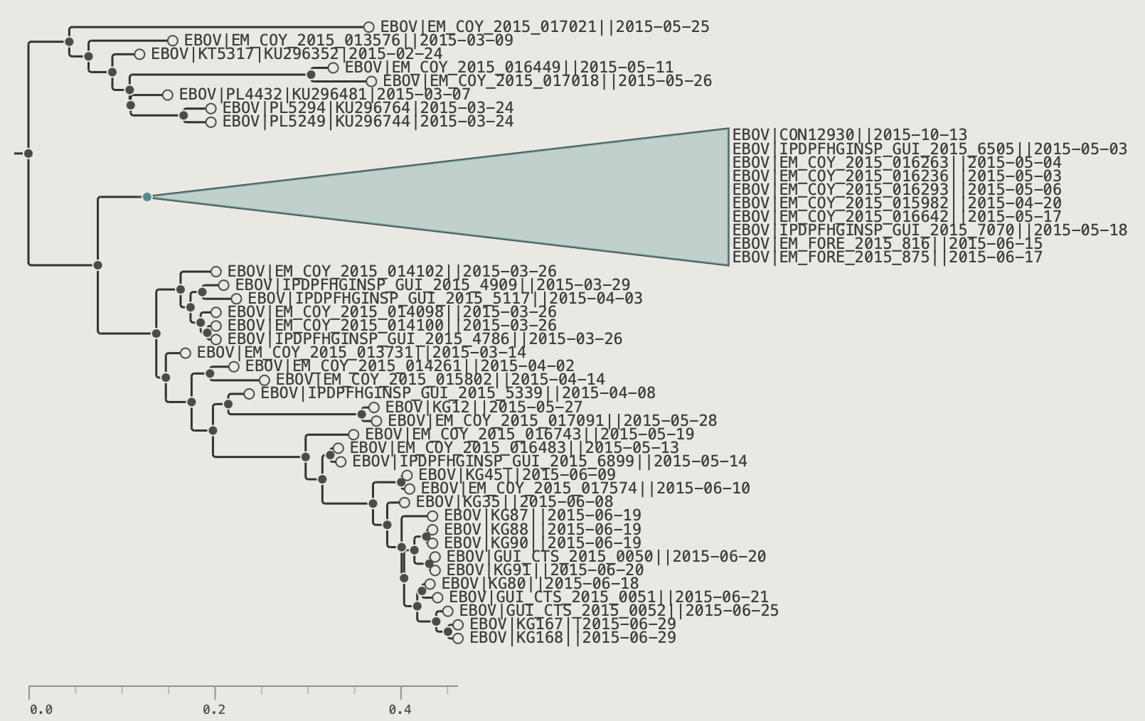
Collapsing Clades
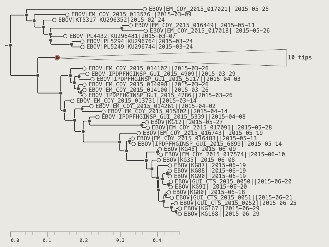
Collapsing replaces a subtree with a filled triangle shape. Unlike hiding, collapsed clades remain visible as a compact summary with a tip-count label.
-
Select an internal node.
-
Click the Collapse button in the toolbar.
The subtree becomes a filled triangle labelled with the clade name and enclosed tip count.
The Span control in the COLLAPSED CLADES section of the control panel can adjust the vertical size of the triangle shapes. If set to the maximum then the triangles become the size of the number of tips that they contain and the individual labels will be shown if sufficiently zoomed in.
Changing a triangle's colour: with a triangle selected, use the colour picker and Paint button in the toolbar to assign a custom fill colour. The eraser button resets to the theme default.
To expand the clade: click the triangle to select it and click Expand. Selecting a clade and then clicking Expand will expand all collapsed subclades and with no selection, all collapse clades visible on the screen.
See the Collapsed Clades section of the Visual Options palette for more controls of the collapsed clades.
Chapter 8: Decorating the Tree
Applying User Colours
The simplest way of adding colours to the tree is to select a node or tip and use the paint brush button.
- Pick a colour using the colour swatch button in the toolbar. You can either select a new colour using the 'Custom colour...' control, or pick one from one of the pre-defined swatches.
The toolbar colour picker — choose a colour from the recent row or a palette.
- Select one or more tips.
- Click the Paint button.
To remove: click the Clear button. With tips selected, clears only those tips; with nothing selected, clears all user colours in the current view.
When a tree is exported as a NEXUS file these colour annotions will be stored and then used when the tree is reloaded.
Visual Options Control-panel
All visual controls live in the Visual Options control-panel on the left hand side. Open it with the control-panel button in the toolbar or press Tab. The control-panel can be closed again by clicking the close button or the toolbar button or by clicking on the tree. The control-panel can be fixed to stay open by clicking the pin button. When pinned the pin button will be gold and the tree will scale horizontally to make space (unpinned, the control-panel will overlay the tree).
Controls are organised into collapsible sections. Click on a panel heading to open it and reveal its control. When another panel section is opened the currently open one will close. Use the pin button to keep the panel section open.
Tree Appearance
The Tree and Branches sections controls the basic visual look of the tree - the background colour and branch colour and width.
Tree
Tree appearance controls.
| Control | Effect |
|---|---|
| Calibrate | Specify a date annoation that can be used to calibrate the timescale of the tree. If a date annoation exists when the tree is loaded it will be selected by default. This control will be hidden if there are no date annotations. |
| Background | The colour of the background canvas of the tree. |
| Root Len | This determines the length of the root branch 'stem' as a percentage of the whole tree from 0% (hidden) to 20% |
Branches
Branch appearance controls.
| Control | Effect |
|---|---|
| Colour | The colour of the branches of the tree |
| Width | Branch line stroke thickness (0.5–8 px) |
| Elbow radius | How curvy the corners of the branches are |
Tip Labels
These controls determine how the tip labels are presented. The tip labels will only be visible when the tree is sufficiently zoomed in that there is space for them (determined by the font size).
Tip Labels
Tip Labels section of the Visual Options palette.
| Control | Effect |
|---|---|
| Show | Off — hide all labels; Names — show tip name; or select an annotation key to display its values instead |
| Filter | Apply a saved named filter so only matching tips get labels (see Chapter 9: Filtering for more information) |
| Layout | Off (labels are adjacent to each tip) or aligned options (Aligned, Dashed, Dots, Solid) — labels align with the rightmost tip with optional connector lines |
| Spacing | Gap between the tip marker and the label text (in pixels) |
| Size | Font size (1–48 pt) |
| Typeface | Font family for tip labels — Theme uses the typeface set in the Theme section; otherwise choose from Monospace, Sans-serif, Serif, or specific named fonts |
| Style | Font weight and style — Theme inherits from the Theme section; or choose Regular, Bold, Italic, or Bold Italic |
| Colour | The default label colour used if no user colour has been specified using the Paint option or if the Colour by option is being used but there is no annotation for that tip |
| Colour by | Use an annotation key for per-tip label colour. See the Colour by section, below. |
| Palette | A Configure buttoon appears when Colour by is active. This button will open a dialog box where a colour palette for this annoation can be selected. |
Branch Labels
Branch labels display annotation values at the midpoint of each branch rather than at a node. This is particularly suited to branch-level annotations such as branch lengths when they should appear visually on the branch itself rather than at the node end. Unlike tip or node labels they are anchored to the branch midpoint and positioned above or below it.
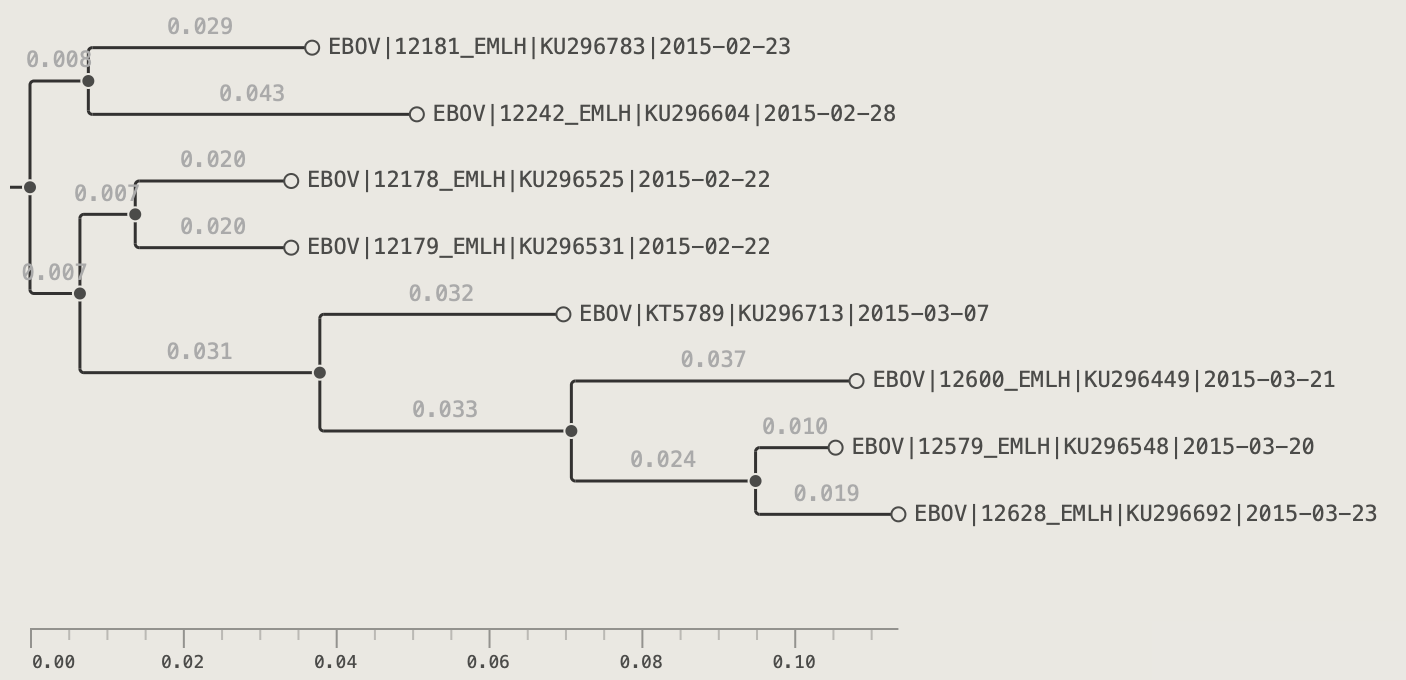
Branch Labels
Branch Labels section of the Visual Options palette.
| Control | Effect |
|---|---|
| Show | Off — hide all branch labels; or select an annotation key to display |
| Filter | Apply a saved named filter so only matching branches get labels |
| d.p. | Decimal places for numeric annotations — Auto picks a sensible precision |
| Position | Above or Below the branch midpoint |
| Spacing | Vertical gap between the branch line and the label text (in pixels) |
| Size | Font size (6–48 pt) |
| Typeface | Font family — Theme inherits from the Theme section |
| Style | Font weight and style — Theme, Regular, Bold, Italic, or Bold Italic |
| Colour | Default label text colour |
| Colour by | Use an annotation key for per-branch label colour |
| Palette | Configure button appears when Colour by is active |
Node Labels
Annotation values are displayed as text labels at each internal node — most commonly used for bootstrap support values, posterior probabilities, clade names, or any node-level annotation. Unlike tip labels, node labels have no layout alignment option; they are always anchored to the node point.
Node Labels
Node Labels section of the Visual Options palette.
| Control | Effect |
|---|---|
| Show | Off — hide all node labels; or select an annotation key to display its values |
| Filter | Apply a saved named filter so only matching nodes get labels |
| d.p. | Decimal places for numeric annotations — Auto picks a sensible precision |
| Position | Where the label sits relative to the node point: Right, Above left, or Below left |
| Spacing | Horizontal gap between the node point and the label text (px) |
| Size | Font size (6–48 pt) |
| Typeface | Font family — Theme inherits from the Theme section |
| Style | Font weight and style — Theme, Regular, Bold, Italic, or Bold Italic |
| Colour | Default label text colour |
| Colour by | Use an annotation key for per-node label colour |
| Palette | Configure button appears when Colour by is active |
Label Shapes
Label shapes are coloured shapes that are drawn to the left of each tip label text, providing additional ways of decorating tips with colours based on annotations. The shapes can be squares, circles or blocks - rectangles that fill the full height between tips to produce a continuous 'stripe'. Circles and squares are useful when the tip labels are not aligned, and blocks work best when the tips labels are aligned (whether visible or not).
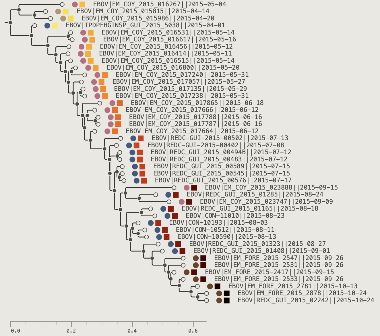
Label shapes are controlled by the LABEL SHAPES control panel and this can be cascaded to add additional label shapes and more controls.
Label Shapes
Label shape controls.
| Control | Effect |
|---|---|
| Shape | Off / Square / Circle / Block |
| Size | Shape height as % of row height |
| Pad left | Specifies the gap on the left side of the shape (in pixels) |
| Colour | Default fill colour |
| Colour by | Use an annotation key for shape colour |
| Shape 2 | Selecting a shape 2 will open up another label shape in a second column. If turned on then another option, Shape 3 will become available. |
Multiple independent shape slots (up to 10) can be added to show several annotation dimensions simultaneously.
Tip Shapes
Tips shapes are filled circles drawn at the end of each tip branch. They can be sized and coloured in the control panel or a 'Colour by' annotation provided to control the colour. A background 'halo' effect can be specifed to outline all the tips shapes as a single layer. The tip shapes are always drawn even when the tree is fully zoomed out.
Tip Shapes
Tip shapes controls.
| Control | Effect |
|---|---|
| Size | Tip circle radius (0 = hidden) |
| Filter | Apply a saved named filter so only matching tips get shapes |
| Colour | Stroke/fill colour |
| Colour by | Use an annotation key for tip colours |
| Palette | Colour scheme when Colour by is active (Configure opens annotation colour settings) |
| Halo | Halo ring radius (0 = hidden) |
| Halo col. | Halo fill colour |
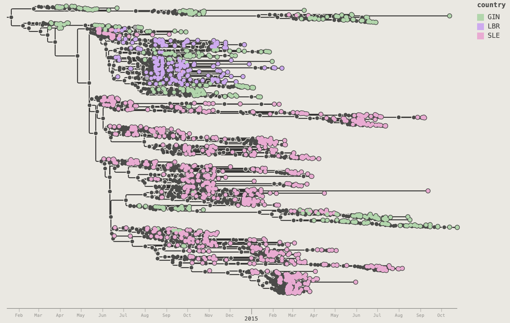
Set Colour by to country to colour each tip by sampling country:
country.Node Shapes
Node shapes are similar to tip shapes but are drawn on the internal nodes of the tree. The same options control them.
Node Shapes
Node shapes controls.
| Control | Effect |
|---|---|
| Size | Node circle radius (0 = hidden) |
| Filter | Apply a saved named filter so only matching nodes get shapes |
| Colour | Stroke/fill colour |
| Colour by | Use an annotation key for tip colours |
| Palette | Colour scheme when Colour by is active (Configure opens annotation colour settings) |
| Halo | Halo ring radius (0 = hidden) |
| Halo col. | Halo fill colour |
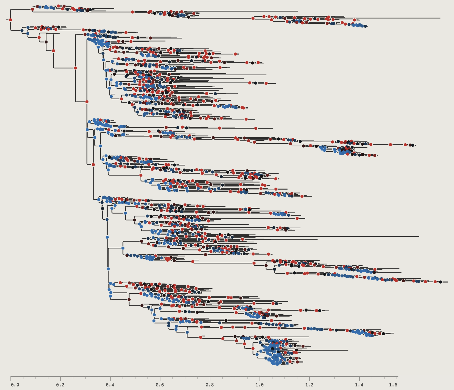
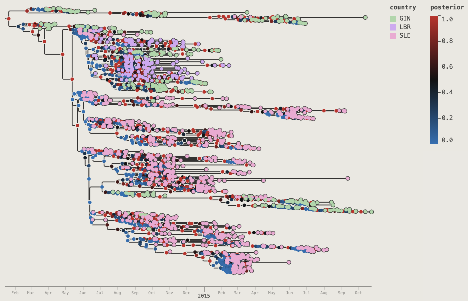
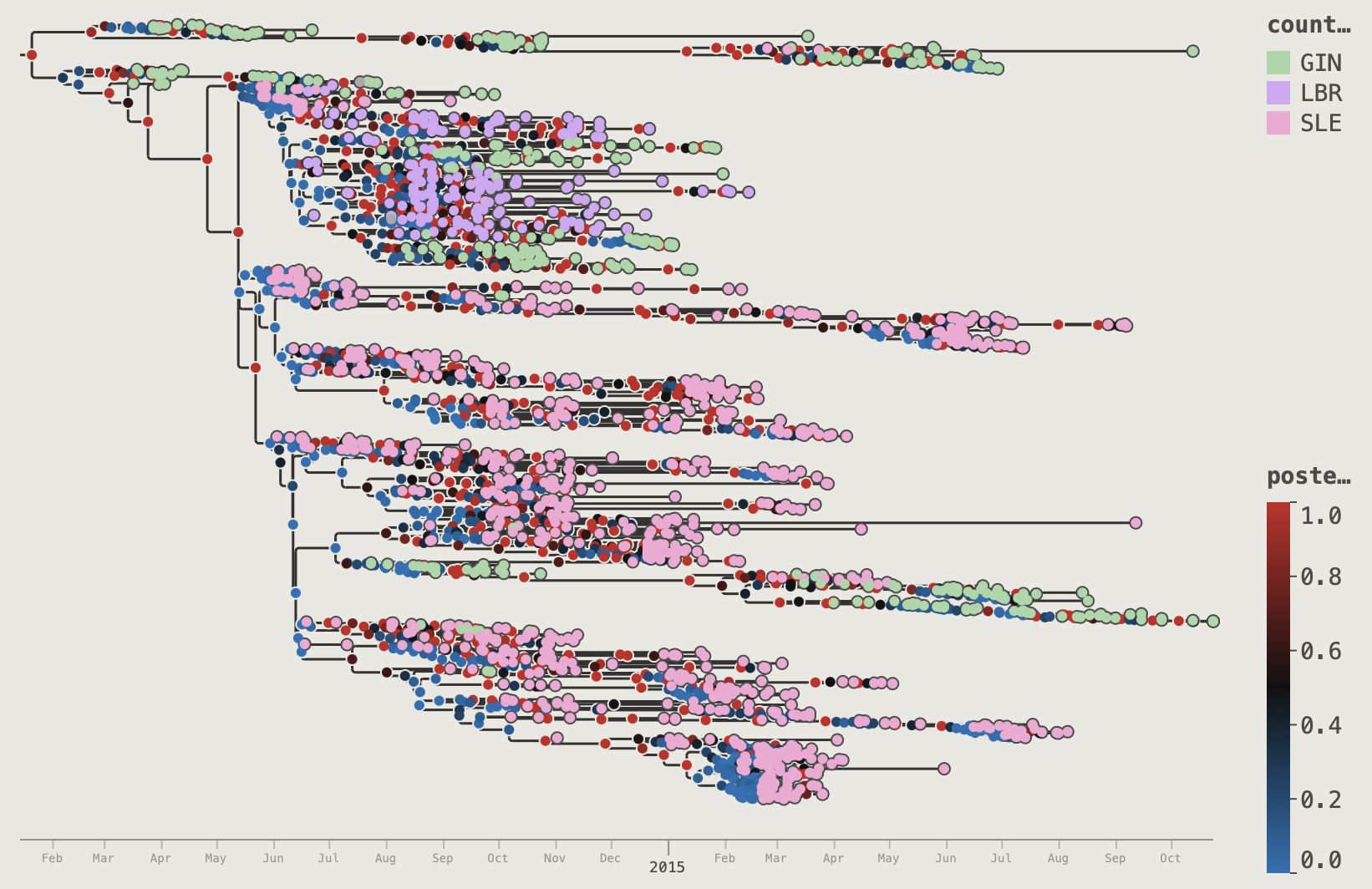
posterior. The colour palette is Blue->Black->Red so nodes are coloured blue if < 0.5, red > 0.5 and black if close to 0.5.Node Bars
When a BEAST tree carries height HPD (highest posterior density) annotations (e.g. height_95%_HPD), the Node Bars section appears in the palette. If no such annotations are present it shows an unavailable message. At present only height_95%_HPD annotation is recognised for use with node bars. If turned on, a horizontal bar will be shown at every node spanning time of the HPDs.
The options for node bars are controlled by the NODE BARS section of the control panel:
Node Bars
| Control | Effect |
|---|---|
| Show | Off / On — toggle bars on/off |
| Filter | Apply a saved named filter so bars draw only on matching nodes |
| Line | Draw a vertical line at the node Mean, Median, or neither |
| Range | Show / Hide — display the full range as whisker lines either side of the bars. |
| Size | Bar height in screen pixels (2–30) |
| Colour | Fill and stroke colour of the bars |
| Opacity | Translucency of the bar fill (0 = transparent, 1 = solid) |
| Stroke | Opacity of the bar border line |
If the are no height HPDs specified in the annotations then this option is not available:
Node Bars
Clade Highlights
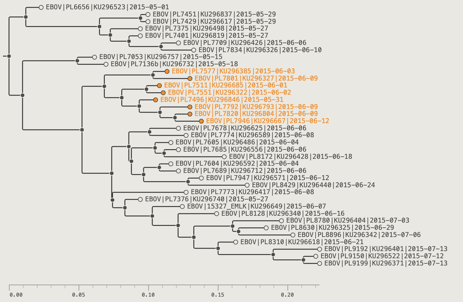
Clade highlights draw a translucent coloured shape behind a selected subtree. These can be used to delineate clades visually.
Adding a highlight:
- Select any internal node (its entire descendant clade is highlighted).
- Select a colour using the colour picker in the toolbar
- Click the Highlight button in the toolbar.
A translucent shape appears behind all descendants of that node. Multiple independent highlights can be active simultaneously — each is stored separately and can have its own colour.
Removing a highlight: select the highlighted node again and click the Highlight button a second time to toggle it off.
Highlight colour: by default each highlight uses the Colour by mapping set in the Clade Highlights section of the palette. Set Colour by to User colour to use the toolbar colour picker, or to any annotation key to automatically colour each highlight by the value of that annotation at the clade root.
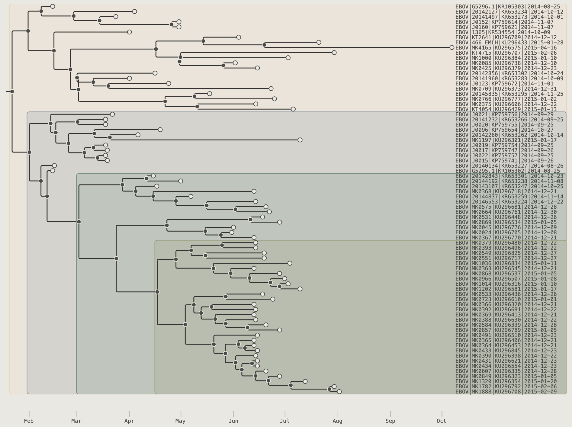
The Outline subtree left edge combined with Outline tips right edge creates a tight polygon that traces the profile of the subtree.
Outline subtree and Outline tips options on.In the Clade Highlights section of the palette:
Clade Highlights
Clade Highlights section of the Visual Options palette.
| Control | Effect |
|---|---|
| Left edge | Rectangle — straight vertical left edge at the clade-root node; Outline subtree — the shape hugs the left profile of every branch in the clade |
| Right edge | At tip — ends just past the clade's rightmost tip circle; At label left — aligns with the global label column; At label right — extends to the right canvas edge; Outline tips — the right edge steps individually around each tip, creating a staircase silhouette |
| Padding | Gap between the clade extent and the highlight border (in pixels) |
| Corners | Corner-rounding radius (in pixels) |
| Colour by | User colour (toolbar swatch) or any annotation key |
| Palette | Colour scheme when Colour by is an annotation key |
| Opacity | Translucency of the fill (0 = transparent, 1 = solid) |
| Stroke | Border line width (in pixels) |
| Opacity | Opacity of the border line |
Colouring by Annotations
Many sections of the Visual Options palette — Tip Labels, Label Shapes, Tip Shapes, Node Shapes, Node Labels, Clade Highlights, and Legends — share a common Colour by control. This dropdown lets you drive the colour of that element from an annotation rather than a single fixed colour.
When Colour by is set to an annotation key, a Configure button appears in that section. Click it to open the colour settings for that key:
Colour settings: posterior
Colour settings for a continuous annotation (posterior), using the Blue-Black-Red diverging palette with a fixed 0→1 scale.
- Palette — choose a categorical swatch set (for string/boolean fields) or a continuous gradient (for numeric fields). Palettes are shared across all sections that colour by the same key.
- Scale mode (numeric annotations only) — controls how the numeric range maps onto the gradient:
| Scale mode | Description |
|---|---|
| Auto | Min and max of the data determine the scale endpoints |
| Symmetric ±0 | Scale is centred on zero; min and max are set to ±*max( |
| From zero | Scale runs from 0 to the maximum value |
| 0 → 1 | Values are assumed to already lie in the 0–1 range |
For a catagorical data type then a number of discrete colour palettes are available:
Colour settings: country
Colour settings for a categorical annotation (country), using the Pastel palette.
Managing Palettes
Click Manage Palettes in the toolbar (also accessible using the Palette Manager button in the annotation Colour Settings dialog) to open the Palette Manager.
Palette Manager
The manager has two tabs:
- Categorical — edit discrete swatch sets: add, remove, or reorder individual colour swatches, duplicate an existing palette as a starting point
- Continuous — edit gradient palettes either as colour stops or an HSB sweep, with full stop editing and duplication
Built-in palettes are read-only but can be copied to make a customisable version using the Duplicate button. User palettes are fully using the Edit button, and can be deleted with the Delete button. Custom palettes are stored on the local machine and can be accessed in all Colour by controls and in the legends. The type of palette (Categorical or Continuous) that can be selected for an annotation will depend on its data type. Dates are considered continuous type.
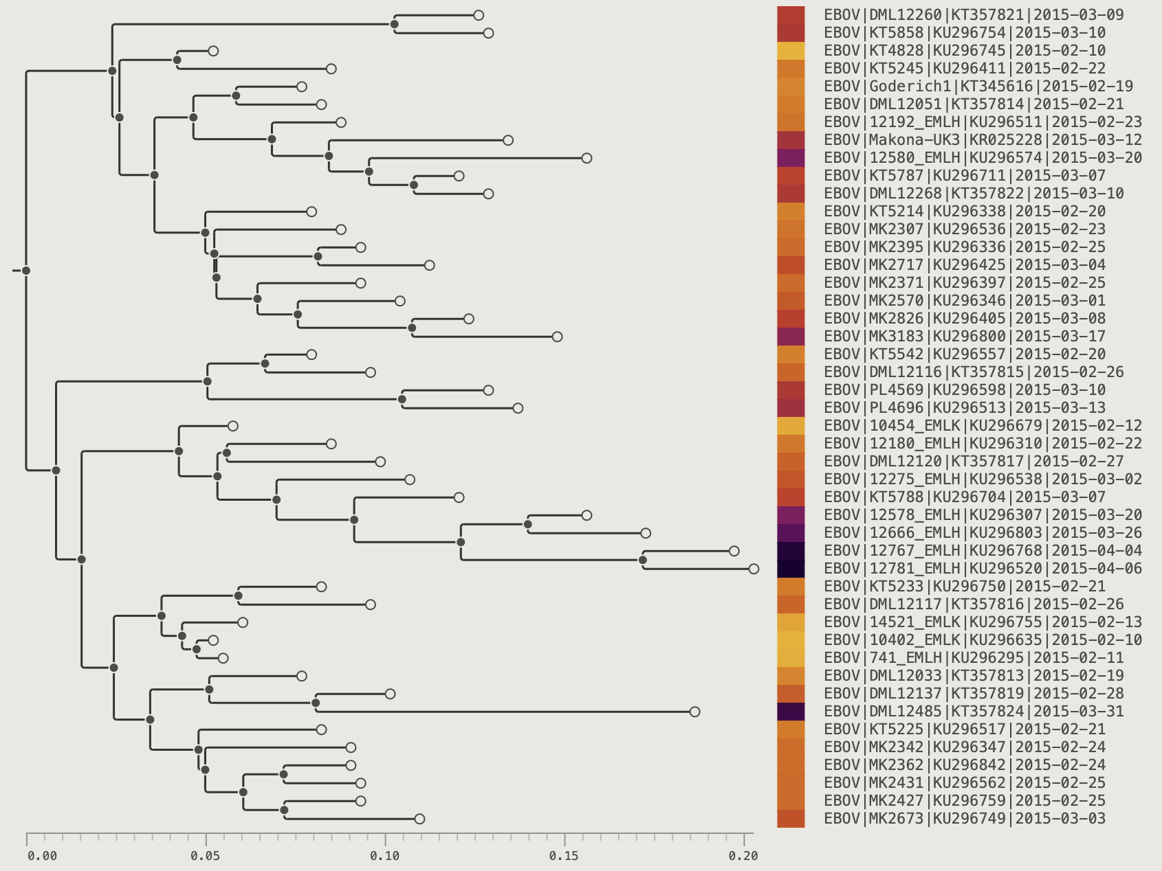
Legends
Legends provide a colour key for any annotation used to colour tips, nodes, or labels. PearTree supports up to four independent legend strips simultaneously, all docked to the right side of the canvas.
In the Legend section of the palette set the Show dropdown menu to an annotation key (e.g. country).
The type of legend drawn will depend on the annotation type (Categorical or Continuous) and the colour key by the palette selected for that annoation (see Managing Palettes, above).
Legend 2–4: additional legends can be configured below Legend 1 by selecting an additional annotation for the control Show 2. This will reveal controls for a second legend and the Show 3 control to add a third legend. Up to four legends can be displayed simultaneously. Set each subsequent legend's Position to Right (shown side-by-side with Legend 1) or Below (stacked vertically).
Use the Span setting to control what vertical fraction of the panel height each legend occupies.
Use the Spacing control to add whitespace between legend columns and between legends stacked in the same column. This can be useful when showing three or four legends at once.
Additional controls set the colour, size and typeface of the legend text.
For numeric or date-like legends, each legend level also has its own d.p. setting (Auto or fixed decimal places) so continuous values can be shown with consistent precision.
Each legend level includes a Palette → Configure button (shown when an annotation is selected), which opens the annotation colour settings dialog for that legend's annotation.
Legend
Legend section of the Visual Options palette, showing a categorical legend (country) and a second continuous legend (posterior) stacked below.
| Control | Effect |
|---|---|
| Show | Select an annotation key to display as a legend, or Off to hide |
| Palette | Configure button opens annotation colour settings for the selected legend annotation |
| d.p. | Decimal places for numeric legend labels — Auto picks a sensible precision |
| Span | Height span of the legend as a percentage of the canvas height (10–100%). With multiple legends stacked, these act as relative values. |
| Spacing | Gap between legend columns and between stacked legends (0–50 px) |
| Colour | Legend text colour |
| Size | Font size for legend labels (6–48 pt) |
| Typeface | Font family — Theme inherits from the Theme section or specify a different typeface |
| Style | Font weight and style — Theme, Regular, Bold, Italic, or Bold Italic |
| Show 2–4 | Select an additional annotation for a second, third, or fourth legend |
| Position | Position of the additional legend relative to the previous: Right (side-by-side) or Below (stacked) |
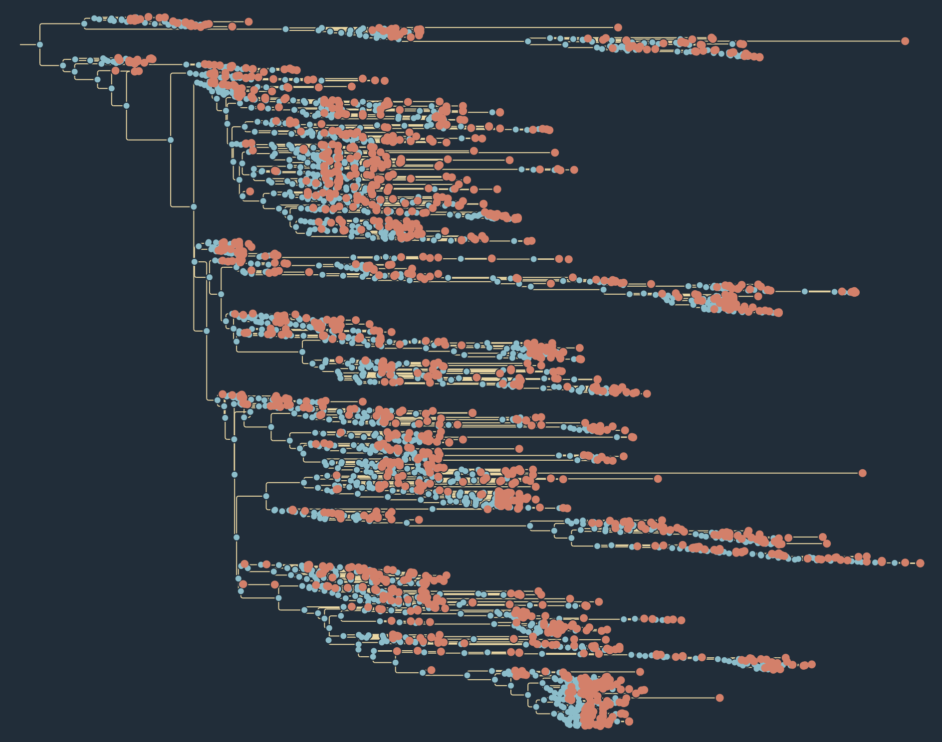
Themes
The Theme section at the top of the palette provides pre-built visual presets.
Changing any individual visual setting switches the selector to Custom. Click Reset to defaults at the bottom of the palette to revert to the default theme (the theme with the ★ next to it). Press the Store button to give the current Custom theme a name and store it locally. This theme will then be available in the selector control. You can also Export and Import themes (if an imported theme has the same name as an existing one you will be asked to rename it).
Theme
Theme section of the Visual Options palette.
| Control | Effect |
|---|---|
| Theme selector | Switch to a built-in or user-saved theme |
| Store | Save the current settings as a named personal theme |
| Default | Make this theme the starting point for new windows |
| Remove | Delete a user-saved theme |
| Export | Download the current theme as a JSON file |
| Import | Load a theme from a JSON file |
| Typeface | Default font family used throughout the tree (overridable per section) |
| Style | Default font weight/style — Regular, Bold, Italic, or Bold Italic |
Chapter 9: Filters and Filtering
Toolbar Quick Filter
The filter controls in the toolbar instantly select visible tips using ad-hoc or saved rules.
The ad-hoc filter has four parts:
-
Search field button — choose which field to query (Name or an annotation key)
-
Operator button — choose the match rule (contains, starts with, numeric comparisons, date comparisons, regex, etc.)
-
Input box — type the value/pattern
-
+ button — save the current ad-hoc query as a named filter
For example, choose Name -> contains and type 2015 to select any tips with '2015' in the name:
Note, however, that it is possible that '2015' will appear by chance in another field. If date is selected then explict options for filtering by date are provided such as in year:
Press the clear button in the box or the Escape key to remove the filter.
Selecting the Add button will add the current options as a Named Filter in the Filter Manager for use as a preset filter in the Toolbar and elsewhere.
Click the funnel button beside the filter box on the toolbar to apply a saved named filter. Named filters can be combined with the ad-hoc filter: a tip must pass both to remain selected. See the next section for more details about the Filter Manager.
Named Filters and the Filter Manager
Use the Manage Filters button to open the Filter Manager dialog. There you can:
- Create filters with nested AND/OR groups
- Add conditions for string, numeric, categorical, and date fields
- Edit or delete existing filters
- Import/export filter sets as JSON
Filters
Each condition targets one annotation field but conditions for different annotations can be combined using the + Condition button. More complex sets of conditions can be created by using the + Group button to create nested sets of conditions with different AND and OR operators.
The operators available depend on the field's data type:
Text / Tip Name
The tip name and any free-text string annotations support these operators:
| Operator | Passes if the value… |
|---|---|
| contains | contains the search string (case-insensitive by default) |
| not contains | does not contain the string |
| starts with | begins with the string |
| not starts with | does not begin with the string |
| ends with | ends with the string |
| not ends with | does not end with the string |
| equals | is an exact match |
| not equals | is not an exact match |
| matches regex | matches the regular expression |
| not matches regex | does not match the regular expression |
A Aa checkbox toggles case-sensitive matching for all string operators.
Categorical
Categorical annotations (e.g. country, lineage) use the same string operators as text fields above, plus two set-membership operators:
| Operator | Passes if the value… |
|---|---|
| in | is one of a set of chosen values (enter values as chips) |
| not in | is not in the set |
Use in / not in to select multiple categories at once without chaining OR conditions.
Continuous (numeric)
Numeric annotations (real, integer, proportion, percentage) support comparison operators:
| Operator | Passes if the value… |
|---|---|
| ≥ | is greater than or equal to |
| ≤ | is less than or equal to |
| > | is strictly greater than |
| < | is strictly less than |
| = (equals) | is exactly equal |
| != (not equals) | is not equal |
Date
Date annotations provide temporal comparison operators:
| Operator | Passes if the date… |
|---|---|
| before | is earlier than the given date |
| after | is later than the given date |
| on or before | is on or earlier than the given date |
| on or after | is on or later than the given date |
| is exactly | is exactly the given date |
| is not exactly | is not the given date |
| in year | falls within the given calendar year (enter as YYYY) |
| not in year | does not fall within the given year |
| month is | falls in the selected month (e.g. September) |
| month is not | does not fall in the selected month |
Dates are entered in the ISO YYYY-MM-DD format.
The Year annotation is a decimal year value automatically generated from the date. This is treated as a numerical annoation for the filters.
Using filters to control the display of visual features of the tree
Saved named filters can be used to restrict where a visual feature is drawn, independently of the toolbar selection.
The following display features have a filtering option: Tip shapes, Tip labels, Node shapes, Node labels, Branch labels and Node bars.
When a Filter is selected for a feature the shapes, labels or bars are only shown for tips or nodes that pass the filter conditions.
If a feature doesn't have a particular annotation (for example, tips will not have a posterior annotation) then that feature will fail the filter and not be shown.
Example — label only the Sierra Leone tips
Using the EBOV example tree, which has a country annotation:
- Open the Filter Manager and create a filter named SLE with the condition country is exactly SLE.
- In Visual Options → Tips, set Show label to
Name. - The Label filter row now appears. Choose SLE from its dropdown.
- Tip labels now appear only on Sierra Leone tips; all other tips are unlabelled.
Example — show node bars only on well-supported nodes (BEAST trees)
For a BEAST MCC tree with a posterior annotation:
- Create a named filter High posterior with the condition posterior ≥ 0.5.
- In Visual Options → Node Bars, turn bars On.
- Set Bar filter to High posterior.
- HPD bars are suppressed on nodes with low posterior support, reducing visual clutter.
Chapter 10: The Tree Scale Axis
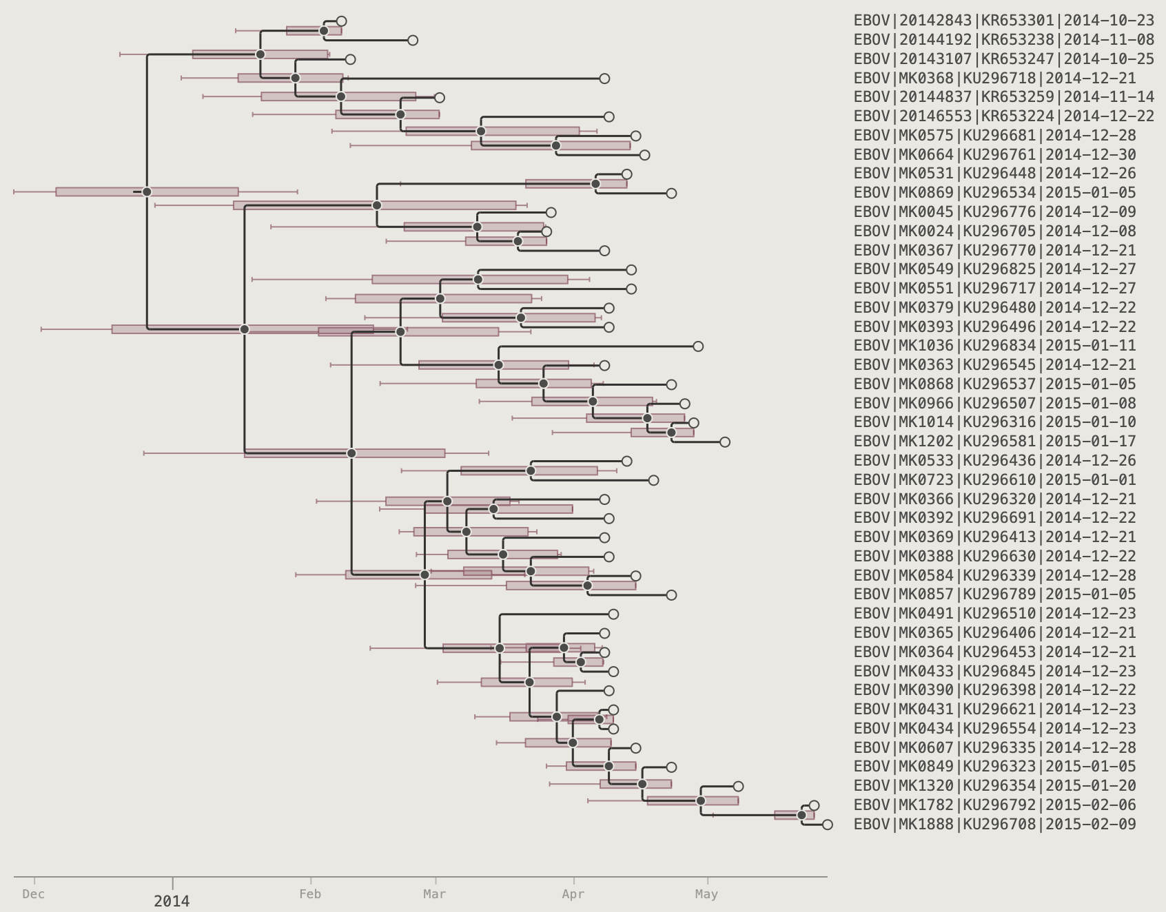
The axis adds a scale bar along the bottom of the canvas. Load the EBOV example tree to follow along — it carries a date annotation for each tip.
In the Axis section of the palette, set Show to one of four modes:
| Mode | Axis type |
|---|---|
| Off | No axis |
| Forward | Divergence from root (0 at root, increases toward tips) |
| Reverse | Distance from the most-divergent tip toward the root |
| Time | Calendar-date axis (requires a date calibration — see below) |
Divergence Axes
Select Forward or Reverse to draw a plain numeric scale immediately — no calibration needed. The units will be the same as the branch lengths supplied in the tree (e.g., substitutions-per-site or number of mutations). If the tree is a time calibrated tree then these will be in the time units used by the branches (i.e., decimal years). When the Forward axis is selected, the origin will align with the root node of the tree. When the Reverse axis is shown the origin will align with the most divergent tip and show the height above this tip.
Time-Calibrated Axis
Selecting the Time axis option will show an axis labelled with dates in a customisable range of formats. This option is only available if there is a tip annotation of the type 'date'. On loading the tree, PearTree will automatically detect an annotation in this format if available. Otherwise it can be loaded in a CSV file (see Importing a CSV or TSV File) or by parsing a date out of the tip names (see Parse Tip Names).
Step 1 — Calibrate
In the Tree section at the top of the control panel, a Calibrate dropdown appears when the loaded tree has at least one annotation that PearTree recognises as a date type. Select that annotation key (e.g., date or collection_date).
Step 2 — Set the axis to Time
In Axis → Show, select Time. The axis now displays calendar dates derived from the calibration.
Step 3 — Configure tick intervals
Two sets of options control the spacing of tick marks on the axis and the labels placed at these tick marks:
| Control | Options | Notes |
|---|---|---|
| Major ticks | Auto / Decades / Years / Quarters / Months / Weeks / Days | Auto gives ~5–8 ticks across the current view |
| Minor ticks | Off / (finer intervals) | Off by default |
| Major labels | Partial / Full / Component / Off | See below |
| Minor labels | Off / Component / Partial / Full | Off by default |
Label modes
| Mode | Year tick | Month tick | Day tick |
|---|---|---|---|
| Partial | 2014 |
2014-09 |
2014-09-12 |
| Full | (full chosen format) | (full chosen format) | (full chosen format) |
| Component | 2014 |
Sep |
12 |
| Off | — | — | — |
For Weeks ticks: Component shows W01–W53; Full and Partial both show 2014-W37.
Example time axis:


The full set of controls for the Time Axis (note that the divergence axis have a subset of these):
Axis
Axis section of the Visual Options palette.
| Control | Effect |
|---|---|
| Show | Off — no axis; Forward — divergence from root; Reverse — distance from the most-divergent tip; Time — calendar-date axis (requires a date calibration) |
| Colour | Colour of the axis line and tick labels |
| Size | Font size for tick labels (6–48 pt) |
| Typeface | Font family for axis labels — Theme inherits from the Theme section |
| Style | Font weight and style — Theme, Regular, Bold, Italic, or Bold Italic |
| Line | Axis stroke thickness (0.5–4 px) |
| Format | Date format for tick labels — choose from 1977-05-04, 1977-May-04, 04 May 1977, May 04, 1977, etc. (Time mode only) |
| Major ticks | Tick interval: Auto / Millennia / Centuries / Decades / Years / Quarters / Months / Weeks / Days — Auto gives ~5–8 ticks across the current view (Time mode only) |
| Minor ticks | Finer tick interval between major ticks, or Off (Time mode only) |
| Major labels | Label style at major ticks: Component, Partial, Full, or Off (Time mode only) |
| Minor labels | Label style at minor ticks: Component, Partial, Full, or Off (Time mode only) |
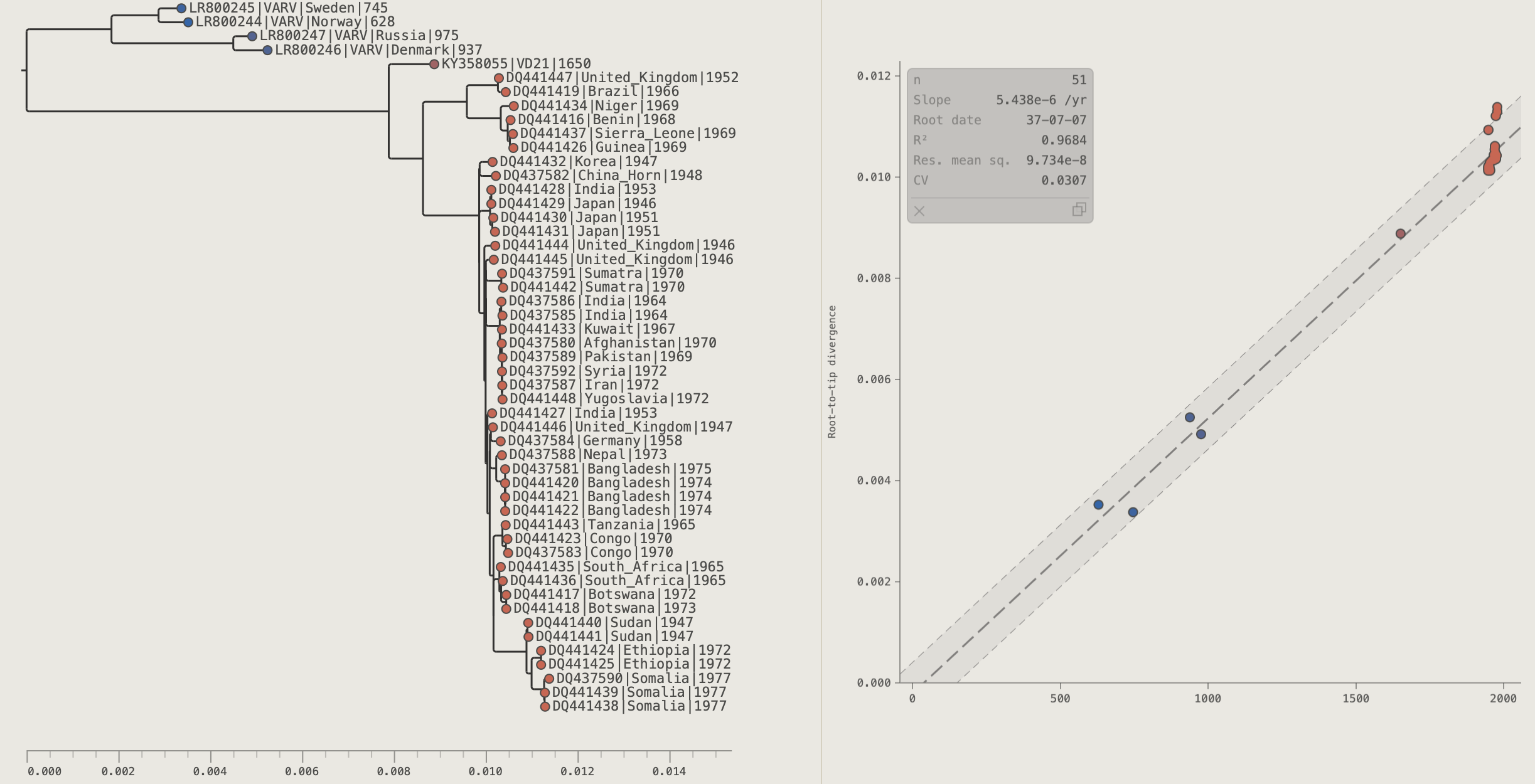
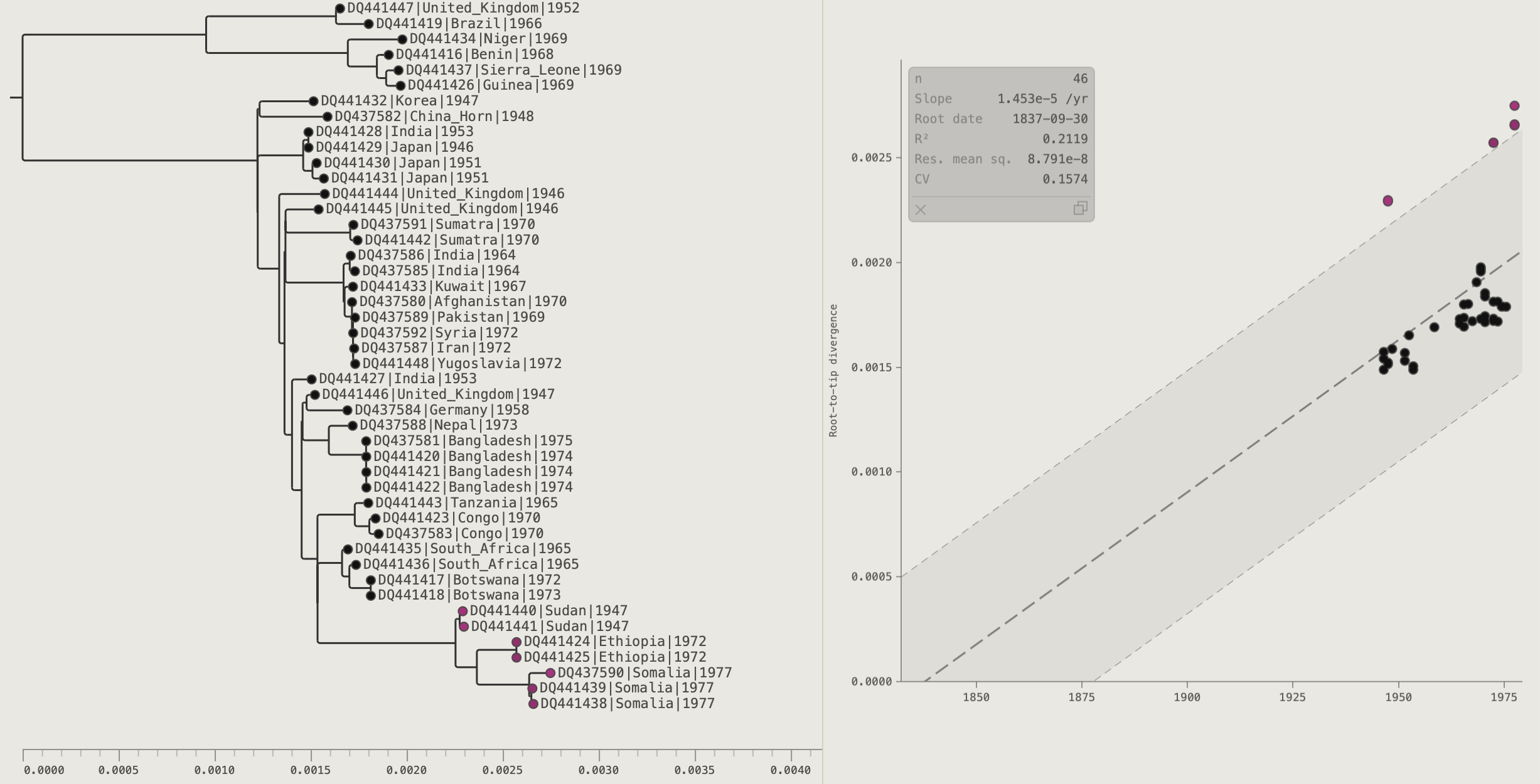
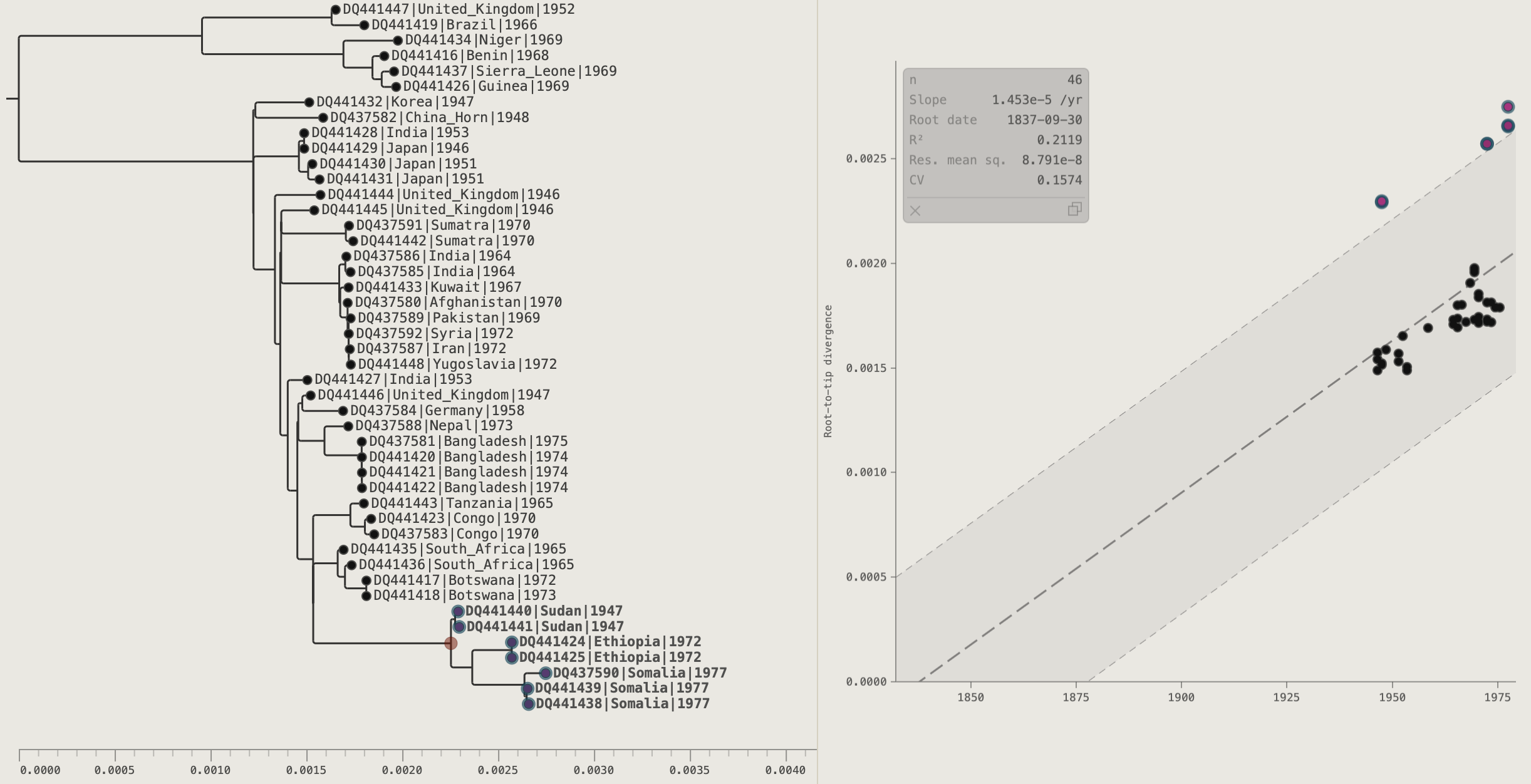
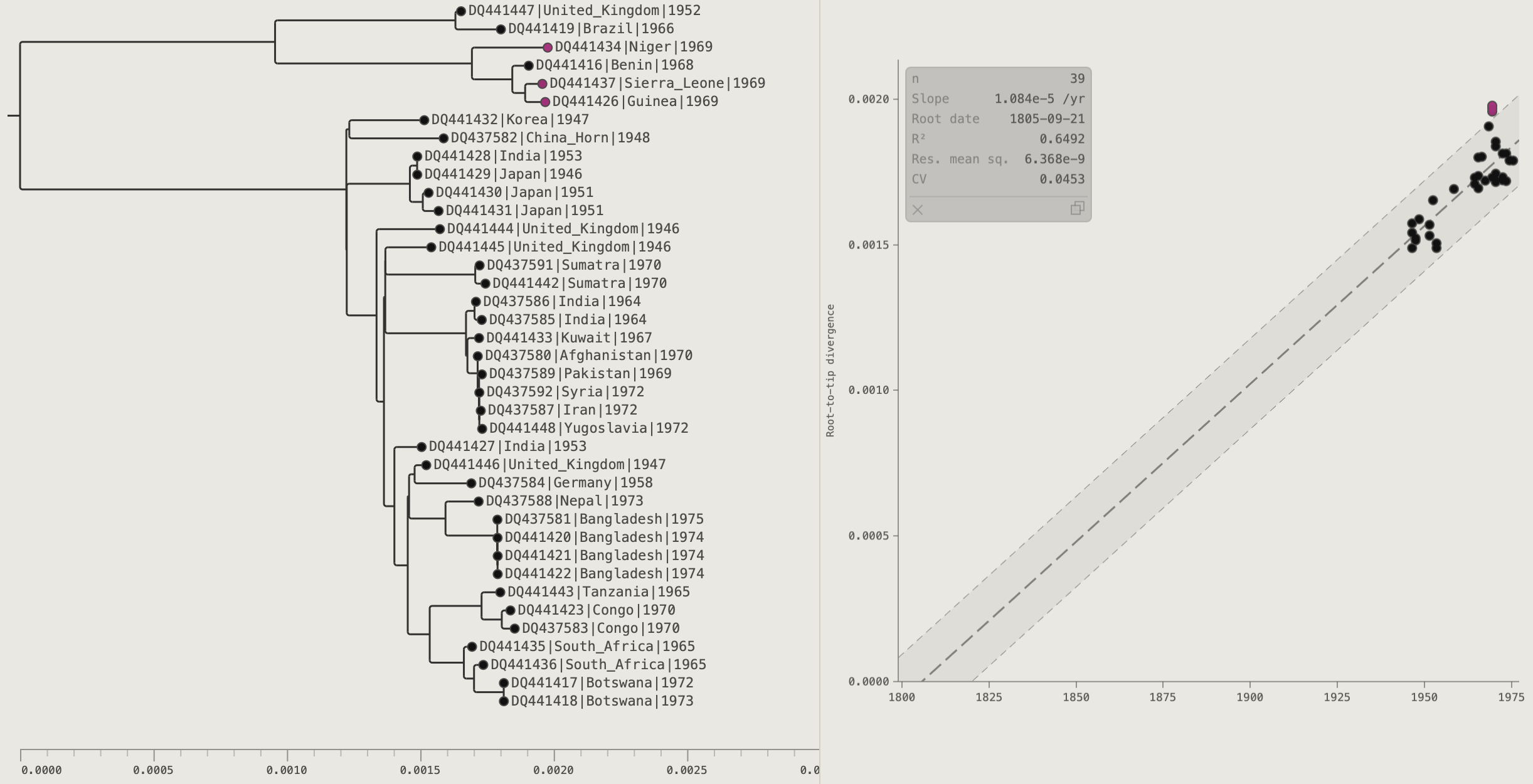
Chapter 11: Rooting and Rerooting
Rerooting is available for trees that are not explicitly rooted (e.g. raw IQ-TREE or RAxML output). For explicitly-rooted trees such as BEAST timed trees, rerooting is disabled. A tree is determined to be rooted if it has annotations for the root node in the loaded tree file. Unless the tree building method is explicitly a time-calibrate one, or an outgroup has been specified, most software will produce a tree with an arbitrary root position. PearTree has a range of options for re-rooting the tree at a more appropriate place.
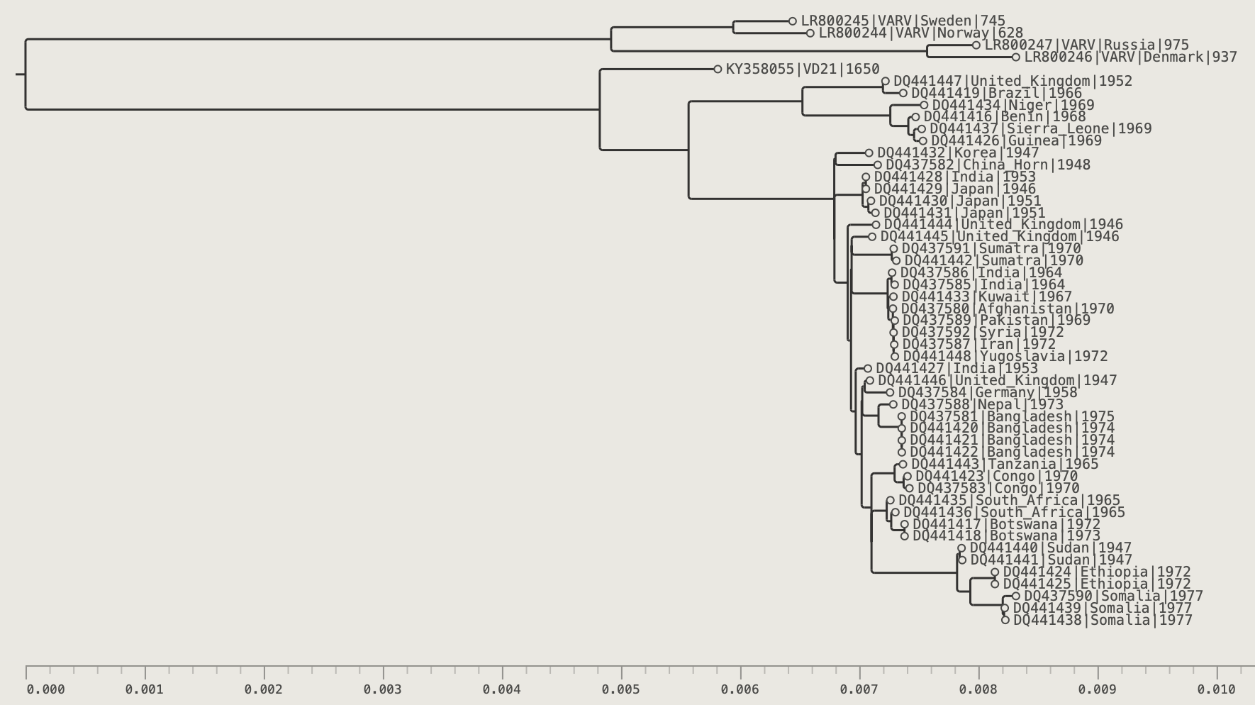
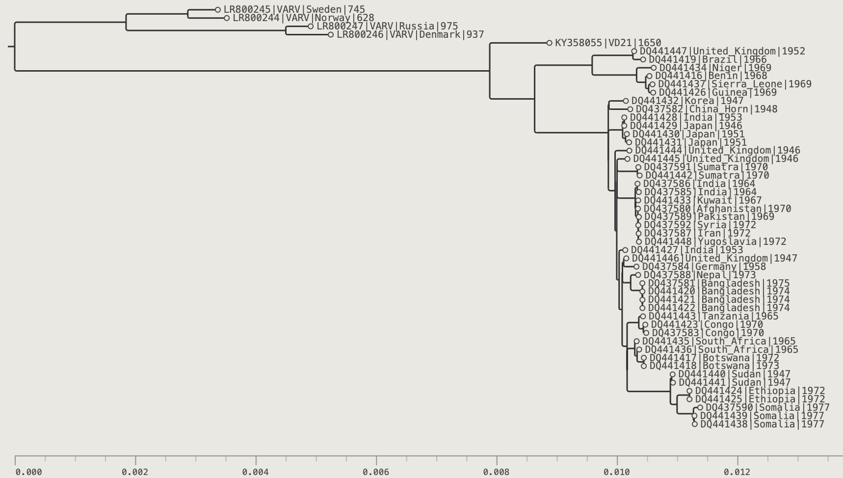
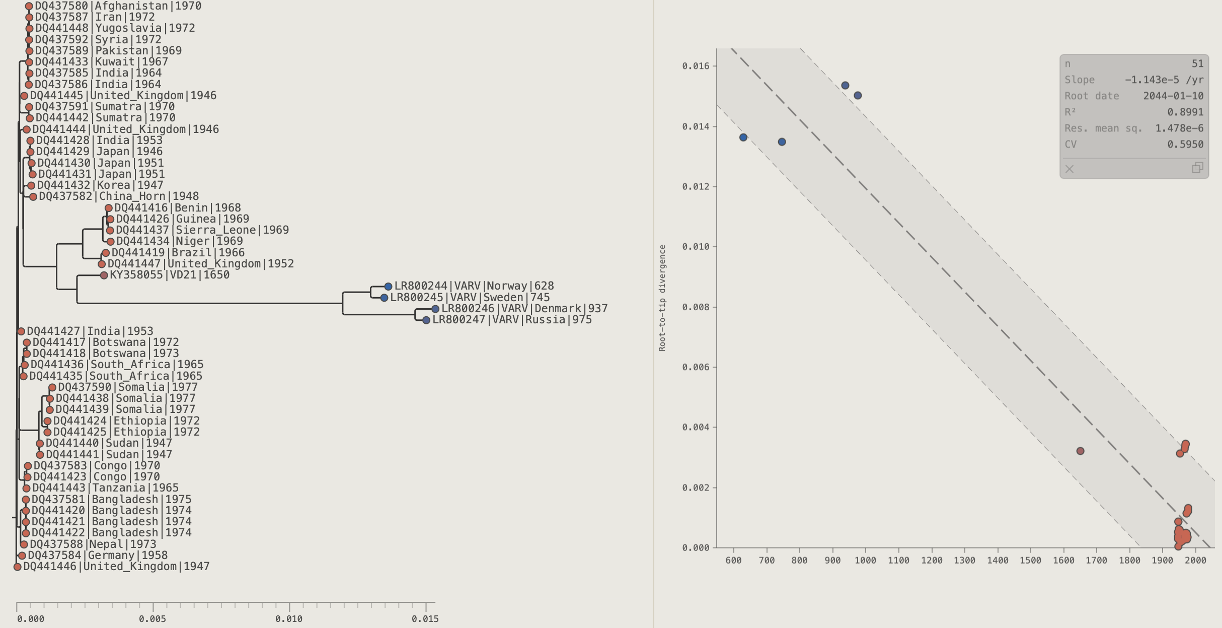
Use the Variola virus (VARV) example data set (either in the Load dialog box or the file in data/varv.tree) to follow the instructions in this chapter.
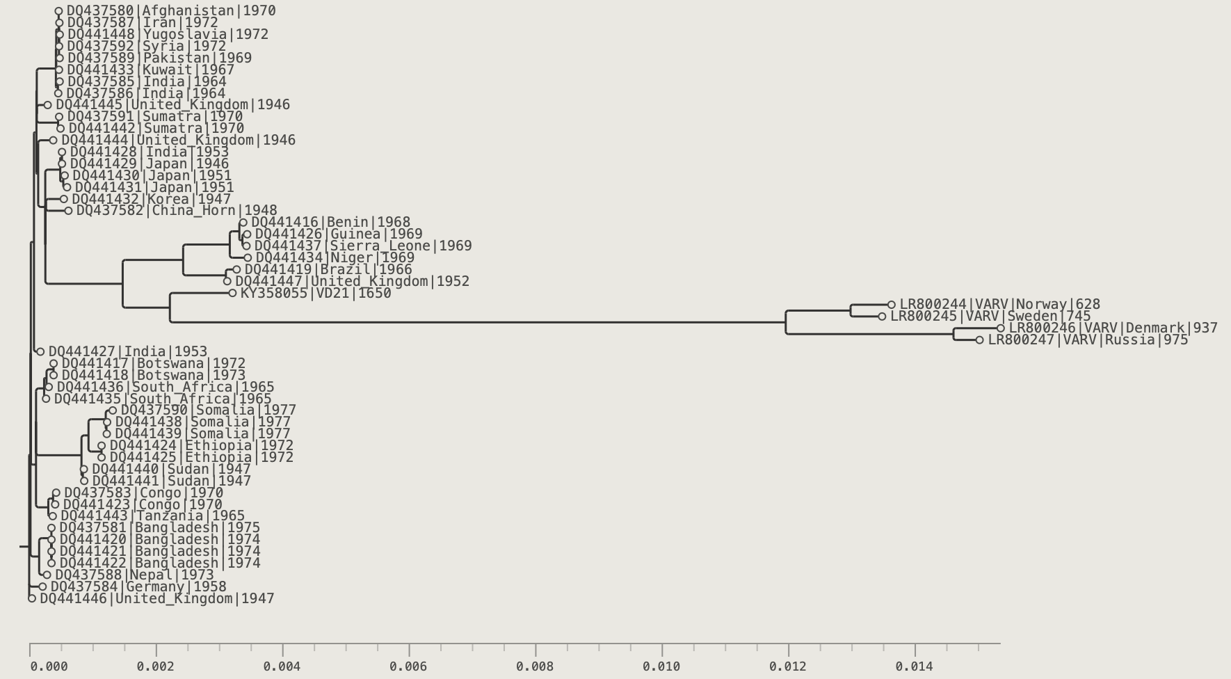
Midpoint Root (⌘M)
The 'Midpoint Root' is the midpoint of the longest tip-to-tip path. In the absence of any other information about the root of the tree, this is a sensible choice is only because it will minimise the horizonal width of the tree so it will fit on the page better.
Press ⌘M or click the Midpoint Root button in the toolbar.
Rerooting at a Selected Node
- Select one or more tips (their MRCA defines the branch to root on) or select an internal node directly.
- Click the Reroot button in the toolbar.
The root is placed at the midpoint of the branch above the MRCA node.
Rerooting at an Exact Branch Position
- Press ⌘B or click the branch-mode button to enter Branches selection mode.
- Click exactly where you want the new root along any branch.
- Click Reroot.
The root is placed at the point selected on the branch.
Temporal Root
The temporal root method finds the root position that is most consistent with a strict molecular clock. The criterion used depends on whether the tree is heterochronous or isochronous.
Heterochronous trees have tips sampled at different points in time (e.g. a virus sequenced across an outbreak). Samples collected later should have accumulated more substitutions, so under a strict molecular clock root-to-tip divergence increases linearly with sampling date. The slope of that line is the substitution rate.
For heterochronous trees, PearTree instead performs a least-squares linear regression of root-to-tip divergence against tip sampling date for every possible root position and selects the position that maximises R² (the proportion of variance explained by the regression).
Isochronous (homochronous) trees have tips all sampled at the same time — for instance species phylogenies or within-host sequences from a single time point. There is no variation in sampling date, so regression against date cannot be used. However, under a strict molecular clock all tips should be equally divergent from the root, so PearTree finds the root position that minimises the variance in root-to-tip divergence. The resulting root is the most clock-like position available given the data.
The Root-to-Tip Panel provides a graphical view of the regression or variance depending on the tree type.
Click Temporal Root buttons in the toolbar. Two modes are available (⌘⇧R= Local, ⌘R= Global):
| Mode | Description |
|---|---|
| Local (default) | Optimises the root position only along the current root branch — fast and useful for fine-tuning |
| Global | Searches every branch in the tree for the optimal root position — slower but finds the best root de novo |
Bootstrap Values and Rerooting
When you reroot a tree, bootstrap support values (and any other values labelled as branch annotations) remain associated with their respective branches, not the internal nodes they were originally assigned to. See Appendix B for a full explanation of how this works.
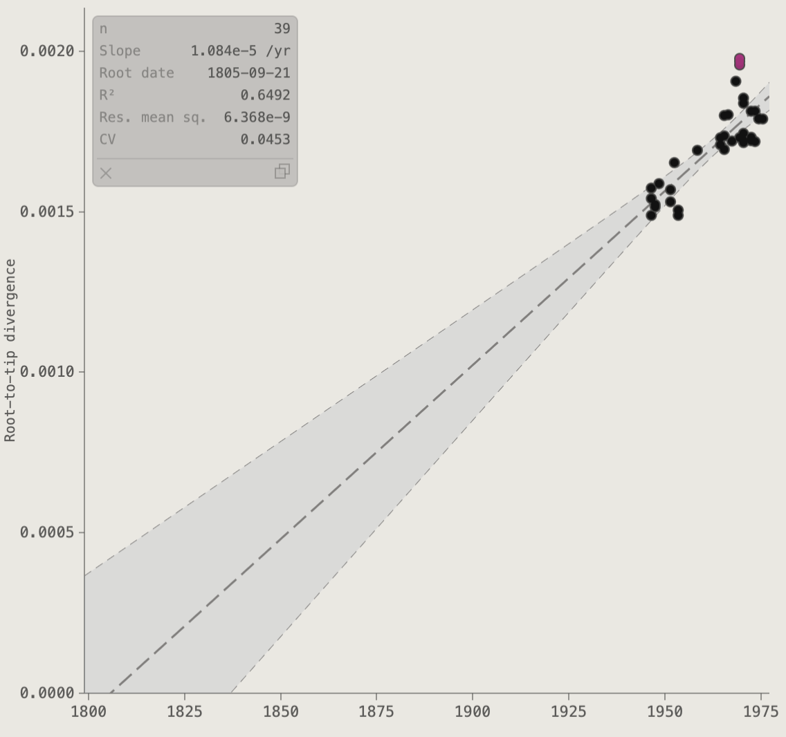
Chapter 12: The Root-to-Tip Panel
The Root-to-Tip (RTT) panel plots each tip's root-to-tip divergence against a tip-date annotation, with a linear regression overlay. It is the standard visual tool for assessing clock-like signal in a timed phylogeny and identifying outlier sequences.
Use the Variola virus (VARV) example data set (either in the Load dialog box or the file in data/varv.tree) to follow the instructions in this chapter.
Click the RTT button in the toolbar to open the panel.
Screenshot placeholder — EBOV RTT panel showing a strong linear clock signal. Points are colour-coded by country.
Panel Layout Modes
| Mode | Description |
|---|---|
| Floating | Panel overlays the right side of the canvas; close with × |
| Fixed | Panel is pinned open alongside the canvas at a configurable width; drag the resize handle to adjust |
Click the pin button in the panel header to toggle. In fixed mode the canvas and RTT panel share the full window width.
Heterochronous Mode (scatter plot)
When tips carry sampling dates, the RTT panel shows a scatter plot:
- Each point is a visible tip; x = sampling date, y = root-to-tip divergence.
- The regression line shows the best-fit linear relationship.
- The slope (substitution rate) and R² (and additional statistics) are displayed in a moveable stats box in the plot corner.
- Outliers — tips that fall far from the regression line — may indicate sequencing errors, mislabelled dates, or recombination.
Residual band
Enable the Band control in the RTT section of the palette to overlay a shaded band around the regression line:
| Mode | Description |
|---|---|
| ±2σ residual | Shaded band spanning ±2 standard deviations of the residuals — shows how spread the data is around the line |
| 95% CI | 95% confidence interval for the mean — a much narrower band showing uncertainty in the regression line position itself |
The band colour, border style, and fill opacity are all independently configurable in the palette.
Drag-select
Click and drag on the plot to select all tips within the drawn rectangle. Alt/Option-drag draws a parallelogram aligned with the regression slope, making it easy to select tips at a particular residual range.
Homochronous Mode (divergence histogram)
When tips have no sampling dates (a homochronous dataset), the RTT panel automatically switches to a divergence histogram.
Screenshot placeholder — RTT histogram for a homochronous tree: bars show the distribution of tip root-to-tip divergences, individual tip dots are shown as a jitter strip above the bars.
- The x-axis is root-to-tip divergence; the y-axis is count.
- Each bar spans an equal-width divergence interval; the bar height is the number of tips in that bin.
- Individual tip points are drawn as a jitter strip in the headroom above the histogram bars. Each point represents one tip, positioned at its exact divergence value on the x-axis, with a small vertical jitter for readability.
- Hovering or clicking a tip point in the strip highlights the corresponding tip in the tree — the same selection and hover linkage as in the scatter plot.
- Drag-select a region in the strip to select all those tips in the tree.
Mean line and band
The same Regression line and Band controls in the palette apply to the histogram view:
- The regression line style settings draw a vertical mean line at the mean divergence.
- The Band control draws a vertical shaded rectangle:
- ±2σ residual — centred on the mean, spanning ±2 standard deviations of all divergence values.
- 95% CI — the 95% confidence interval for the mean divergence (much narrower than ±2σ).
Interacting with the Plot
- Click a point — selects the corresponding tip in the tree and highlights its row in the data table.
- Select a tip in the tree — its point is highlighted in the RTT plot.
- ⌘-click — add to or remove from the current selection.
RTT Visual Options
In the RTT section of the Visual Options palette:
| Control | Effect |
|---|---|
| X-axis origin | Data range (axis starts at the earliest tip) or Root age (axis starts at the root age) |
| Aspect ratio | Fixed aspect ratio for the plot area, or fit panel to fill the available space |
| Grid lines | Show horizontal, vertical, both, or no grid lines |
| Reg. line | Style: Solid, Big dash, Dash, or Dots |
| Reg. colour | Regression / mean line colour |
| Reg. width | Regression / mean line thickness (px) |
| Band | Off / ±2σ residual / 95% CI — applies to both scatter and histogram modes |
| Band style | Border style: Solid, Big dash, Dash, or Dots |
| Band colour | Border line colour |
| Band width | Border line thickness (px) |
| Band fill | Fill colour |
| Band fill opacity | Fill translucency (0 = invisible, 1 = solid) |
| Box bg / text | Statistics box background and text colours |
| Axis colour | Plot axis, tick, and label colour |
| Axis font | Tick-label font size |
| Axis line | Axis stroke thickness |
| Typeface / Style | Font family and style for axis labels |
| Format | Date format for time-calibrated x-axis |
| Major / minor ticks | Interval and label configuration (same options as the main time axis; shown only in heterochronous mode) |

Chapter 13: The Data Table Panel
The Data Table panel lists all visible tips in tree order, with one column per annotation. Open it with the Data Table button in the toolbar.
Screenshot placeholder — Data Table panel pinned alongside the EBOV tree, showing tip names and imported annotation columns.
Panel Layout Modes
Like the RTT panel, the Data Table can be floating or pinned fixed. Click the pin button in the panel header to toggle. Drag the resize handle (the border between tree and table) to adjust the width.
Synchronisation with the Canvas
The Data Table is fully synchronised with the tree in both directions:
- Selecting a tip or node in the tree highlights the corresponding row(s).
- Clicking any row selects that tip in the tree and scrolls the canvas to its position.
- Collapsing, hiding, or filtering tree nodes updates the table instantly.
Collapsed Clades in the Table
Collapsed clades appear as either one row per enclosed tip or a single placeholder row, allowing you to browse and select tips within a collapsed clade without expanding it.
Restricting Columns
By default all annotation columns are shown. Rename keys in the Annotation Curator for cleaner column headers. When using the embed API, pass dataTableColumns to show only specific columns in a fixed order.
Chapter 14: Exporting
Exporting the Tree File
Click the export tree button (or press ⌘S) to save the tree.
Export Tree
| Option | Values | Notes |
|---|---|---|
| Format | NEXUS / Newick | NEXUS supports annotations and embedded settings; Newick is the most portable format |
| Scope | Entire tree / Current subtree view | Exports only the nodes currently on screen when Current subtree view is chosen |
| Annotations | Checkboxes per annotation key | Deselect any keys you do not want to include |
| Embed settings | Checkbox (NEXUS only) | Writes all current visual settings into the file |
Exporting a Graphic
Click the export graphic button (or press ⌘⇧E) to download an image.
Export Graphic
| Option | Values | Notes |
|---|---|---|
| Format | SVG / PNG | SVG is vector and infinitely scalable; PNG is raster at 2× screen resolution |
| View | Current view / Full tree | Full tree exports the complete vertical extent of the tree, not just the visible viewport |
| Transparent background | Checkbox | Omits the background fill (useful for compositing over a coloured page) |
SVG exports include branches, labels, shapes, legend strips, and the axis as true vector elements — ideal for publication figures.
Chapter 15: Settings and Persistence
Automatic Saving
PearTree automatically saves all visual settings to browser localStorage (web app) or a local settings file (desktop app). Settings are restored on the next visit or launch, including theme, palette values, colour-by choices, legend and axis configuration, and branch order.
Resetting to Defaults
Click Reset to defaults at the bottom of the Visual Options palette to restore the Artic theme and all factory default values.
Embedding Settings in a NEXUS File
Export a NEXUS file with Embed settings ticked (see Chapter 14) to bundle all current visual settings with the tree data. Opening that file in PearTree on any machine restores the full appearance, making this the recommended way to share a tree with its visual configuration.
Opening a File from the Command Line (Desktop App)
On macOS you can open a tree file directly in PearTree from Terminal:
open -a PearTree /path/to/my.nwk
If PearTree is already running, the file opens in a new window. On Windows, drag the file onto the PearTree icon in the taskbar, or use Open With from the Explorer context menu.
Appendix A: Keyboard Shortcuts
On Windows and Linux replace ⌘ with Ctrl.
| Shortcut | Action |
|---|---|
| ⌘O | Open system file picker (desktop) or Open Tree dialog (web) |
| ⌘⇧O | Open Tree dialog |
| ⌘⇧A | Import annotations |
| ⌘S | Export tree |
| ⌘⇧E | Export graphic |
| Tab | Toggle Visual Options palette |
| ⌘= / ⌘+ | Zoom in |
| ⌘− | Zoom out |
| ⌘0 | Fit all |
| ⌘⇧0 | Fit labels |
| ⌘A | Select all visible tips |
| ⌘⇧I | Invert selection |
| ⌘B | Toggle Nodes / Branches mode |
| ⌘D | Order: larger clades toward bottom |
| ⌘U | Order: larger clades toward top |
| ⌘M | Midpoint root |
| ⌘R | Global temporal root |
| ⌘⇧R | Local temporal root (optimise on current root branch) |
| ⌘I | Node info |
| ⌘[ | Navigate back |
| ⌘] | Navigate forward |
| ⌘\ | Home (return to full tree view) |
| ⌘⇧, | Climb up one level |
| ⌘⇧. | Drill down into selected subtree |
| ⌘↑ / ⌘↓ | Scroll one page up / down |
| ⌘⇧↑ / ⌘⇧↓ | Jump to top / bottom of tree |
| ~ (hold) | Activate hyperbolic lens at cursor |
| ⌘⇧= | Expand lens flat zone |
| ⌘⇧− | Contract lens flat zone |
| Escape | Dismiss lens / close dialog / clear selection |
Appendix B: Bootstrap Values, Branch Annotations, and Rerooting
Node Annotations vs. Branch Annotations
Every internal node can carry two conceptually distinct kinds of data:
- Node annotations — properties of the node itself (e.g. Bayesian posterior probability, inferred node height in time). These belong to the node regardless of where the root sits.
- Branch annotations — properties of the branch leading from the node to its parent (e.g. bootstrap support). These belong to the branch, not the node, and must travel with it when the tree is rerooted.
Bootstrap Values in Tree Files
Bootstrap support values are conventionally written as internal node labels in Newick format:
((A:0.1,B:0.1)95:0.01,(C:0.1,(D:0.1,E:0.1)72:0.2)80:0.3);
Here 95, 72, and 80 are bootstrap values. They are stored at the node in the file format, but they describe the branch leading from that node to its parent. PearTree automatically marks these well-known keys as branch annotations: bootstrap, support, label, posterior, posterior_probability, prob, probability.
For non-standard key names (e.g. UFBoot from IQ-TREE), open the Annotation Curator and tick Branch annotation manually.
How Rerooting Moves Branch Annotations
When you reroot on a new branch, PearTree updates all branch annotation values along the path between old and new root:
- Each node on the path receives the value that was on the branch above it (toward the old root), because after rerooting that is the branch entering that node from its new parent.
- The node adjacent to the old root, whose branch is split to create the two new root branches, loses its value — there is no meaningful bootstrap for a newly created root edge.
- All nodes not on the path are unaffected.
Multiple sequential reroots are handled correctly. BEAST trees carry posterior as a node annotation (not a branch annotation), and rerooting is disabled for them in any case.
Appendix C: URL Parameters and Sharing
When using the PearTree web application, you can construct a URL that pre-loads a tree and applies settings automatically.
Basic Tree Link
https://peartree.live/?treeUrl=https://example.com/my.tree
The remote server must send Access-Control-Allow-Origin: *. GitHub raw file URLs work without any configuration:
https://peartree.live/?treeUrl=https://raw.githubusercontent.com/artic-network/peartree/main/data/ebov.tree
Anyone who follows the link sees the tree immediately — no download or upload required.
Available Parameters
| Parameter | Description |
|---|---|
treeUrl |
URL of a remote Newick or NEXUS file to load on startup |
tree |
URL-encoded inline Newick or NEXUS string |
filename |
Filename hint for format detection (e.g. my.nwk) |
Settings embedded in a NEXUS file opened via treeUrl are applied automatically. A single URL can therefore deliver both the tree data and its complete visual configuration to any recipient with no setup required.